WCAG Contrast Ratios: A Designer’s Cheat Sheet

Verdict: The Short Version
Contrast ratio measures how bright text looks against its background. WCAG, the Web Content Accessibility Guidelines, sets hard minimums. Memorize four numbers and you cover almost all cases:
- 4.5:1 for normal body text (WCAG 2.2, level AA).
- 3:1 for large text, meaning 18 point or larger, or 14 point bold and up.
- 3:1 for UI components, icons, focus indicators, and chart marks.
- 7:1 only when you chase level AAA for body text.
The stakes are real. WebAIM’s 2026 Million study found low-contrast text on 83.9 percent of home pages, the most common accessibility failure it detected (webaim.org/projects/million). In the United States, the ADA Title II web rule names WCAG 2.1 AA as the technical standard for state and local government sites, with compliance dates of April 26, 2027 and April 26, 2028 depending on population size (ada.gov/resources/2024-03-08-web-rule). The sections below unpack how the numbers work, where designers slip, and how to fix each pattern.

The Math Behind a Contrast Ratio
Automated checkers compute contrast from relative luminance, a measure of how much light a color reflects. They take the luminance of the lighter color (L1) and the darker color (L2) and divide: (L1 + 0.05) / (L2 + 0.05). The scale runs from 1:1 (white on white, no difference) to 21:1 (black on white, the maximum). Because the formula compares two values, swapping foreground and background gives the same number.

Real designs complicate this math. Transparency, gradients, and photographs behind text all break the single-pair assumption. A checker reads one pixel pair; your reader sees a gradient shift across a whole line. The safe move: test the pairing with the lowest contrast in the range, or place the text on a solid layer with a scrim behind it.
“Looks fine on my screen” fails as a test. A bright studio display hides problems that a dim projector or a sunlit phone reveals. Run the number instead of trusting your eyes. I keep the four ratios from the verdict section pinned in my design channel and check each new palette against them before it ships.
One more wrinkle: checkers disagree on sampled pixels. Two tools can report different ratios for the same element when one samples the text edge and the other samples the pixel beside it. Treat the lowest reported number as the truth. Borderline values deserve margin. A tool reporting 4.6:1 on body text is a signal to nudge the color darker. Screens vary, and a pass with no margin fails in the field.
Also Read:

Each Threshold You Must Hit
WCAG 2.2 groups contrast rules into numbered success criteria. The table below lists the ones that affect visual design, the ratio each demands, and the conformance level each belongs to. Levels run A (basic), AA (the legal and industry standard), AAA (enhanced).
| Success Criterion | Minimum Ratio | Applies To | Level |
|---|---|---|---|
| 1.4.3 Contrast (Minimum) | 4.5:1 | Body text under 18pt (or under 14pt bold) | AA |
| 1.4.3 Contrast (Minimum), large text | 3:1 | Text at 18pt+, or 14pt+ bold | AA |
| 1.4.6 Contrast (Enhanced) | 7:1 | Body text (large text: 4.5:1) | AAA |
| 1.4.11 Non-text Contrast | 3:1 | UI components, icons, focus indicators, chart marks | AA |
| 1.4.12 Text Spacing | No content lost | Line height 1.5x, paragraph spacing 2x, letter spacing 0.12x, word spacing 0.16x | AA |
| 2.5.8 Target Size (Minimum) | 24 x 24 CSS px | Pointer targets | AA |
| 1.4.4 Resize Text | 200% zoom | Text stays readable at 200% browser zoom | AA |
Two caveats matter. Logos and purely decorative or incidental text sit outside these rules. Large text also earns the lower 3:1 bar only when it meets the size definition: 18 point or larger, or 14 point bold and up. The full criterion text lives in the W3C WCAG 2.2 specification, and the non-text rules have their own section at SC 1.4.11.
Designers miss 1.4.4 more than any other row in that table. Zoom the page to 200 percent and watch for text that clips, overlaps, or disappears inside fixed-height containers. Fixed pixel heights cause most of these failures; min-height and flexible layouts pass with no extra work.

Six UI Patterns That Fail Contrast Audits
I have run enough contrast audits to predict where they break. The same six patterns show up again and again.
1. Placeholder gray. #777777 on white computes to 4.47:1. WCAG rounds nothing: 4.47 is not 4.5, so the placeholder fails (webaim.org/articles/contrast). Fix: darken placeholders until they clear 4.5:1, and keep a real label above the field.
2. Disabled inputs. Grayed-out text on a gray field often lands near 2:1. Testers grant disabled states some slack, but a user with low vision still needs to read what the field is. Fix: keep the label at full contrast and mute only the input value, or strengthen the field border.
3. Secondary text on tinted cards. Medium gray on light gray looks elegant and computes to something like 3.8:1. Fix: push the text darker or the card lighter until the number clears 4.5:1.
4. Light text on brand-color buttons. Brand palettes get chosen for identity, not contrast, so white text on a mid-tone brand color often lands around 3:1. Fix: test the exact pairing; when the brand color fails, darken the button or switch to dark text.
5. Status shown by color alone. Red versus green dots for error versus success violate the Use of Color rule (SC 1.4.1), which demands that color carry meaning with a second channel. The National Eye Institute reports that about 1 in 12 men have color vision deficiency, so red-green pairs exclude a large slice of real users (nei.nih.gov). Fix: pair each status color with an icon or a text label. This is where microinteractions earn their keep: a small animation plus a label communicates state with no color required.
6. Thin icons and chart segments. SC 1.4.11 extends the 3:1 bar to icons, focus indicators, and the essential marks in charts. A hairline-stroke icon in light gray on white rarely passes. Fix: thicken strokes, darken the mark, or test the icon against its actual background instead of a white artboard.
The State of the Web’s Contrast Problem
WebAIM publishes the Million study each year: an automated audit of one million home pages. The 2026 edition puts low-contrast text at the top of the failure list. It appeared on 83.9 percent of home pages, up from 79.1 percent in 2025, and it was the single most common detected failure. The average page carried 34 distinct instances, up 15 percent from the year before. Overall, 95.9 percent of home pages had at least one detected WCAG 2 failure, up from 94.8 percent (webaim.org/projects/million).
Those numbers describe a mainstream problem. Glare on a phone, a dim projector in a meeting room, and eyes that lose contrast sensitivity with age all punish weak text. Add the 1-in-12 color vision deficiency rate and legible type serves your whole audience. I treat these studies as a design brief: legibility is a feature your users feel on any screen.
Designers own this fix more than developers do. Color choices get locked in mockups, and by the time code ships, changing a palette means reopening decisions across the team. Catch contrast at the design stage and the fix costs minutes. Catch it in QA and the fix costs a sprint.
Deadlines, Tooling, and Where to Check
Legal pressure is catching up. The US Department of Justice’s ADA Title II web rule names WCAG 2.1 Level AA as the technical standard for state and local government web content and mobile apps. An interim final rule published in the Federal Register on April 20, 2026 extended the compliance dates: April 26, 2027 for entities serving populations of 50,000 or more, and April 26, 2028 for smaller entities and special districts (ada.gov/resources/2024-03-08-web-rule).
Meanwhile WCAG 3.0 remains a Working Draft dated 10 September 2026. W3C marks it as a work in progress, inappropriate to cite as a standard (w3.org/TR/wcag-3.0). Ship against 2.2 and revisit the draft once it stabilizes.
For the daily workflow, bake contrast checks into the review loop. Browser DevTools and checkers like Axe and WAVE flag failing pairs on the live page. The stronger move is structural: store pre-verified color pairs as design tokens so a light text token can combine with a light background token by accident. Figma-to-code tools then carry those checked values through handoff with no drift.
Conclusion: Put This Cheat Sheet to Work
The full checklist fits on an index card: 4.5:1 for body text, 3:1 for large text and UI components, 7:1 for AAA. Start with the four surfaces users read most: hero copy, body text, buttons, and placeholder text. Audit those this week and you fix the bulk of your exposure.
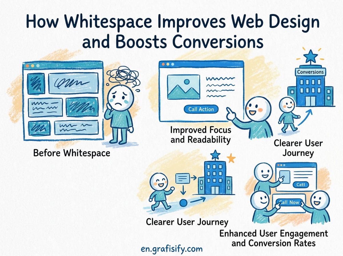
Contrast is one layer of perceived quality. Pair legible type with purposeful motion that builds trust, and give your layouts air: layout choices like whitespace that lift conversions make contrast easier to hold. Share this sheet with your team, pin it in your design channel, and make the 4.5:1 check part of each design review.
Keep a short list of approved text-background pairs next to the palette in your design file. New team members pick from the list instead of inventing pairs, and each pair on the list carries its number. That list is the cheapest accessibility win a team can ship.

Irfan is a Creative Tech Strategist and the founder of Grafisify. He spends his days testing the latest AI design tools and breaking down complex tech into actionable guides for creators. When he’s not writing, he’s experimenting with generative art or optimizing digital workflows.






 Artificial Intelligent
 Design & Creative
 Freelance
 Gadgets & Gear
 Insights
 Laptop
 Reviews
 Smartphone
 Tech Guides
 Vibe Coding