How Whitespace Improves Web Design and Boosts Conversions
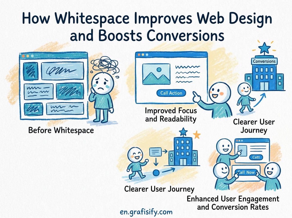
Verdict: Whitespace Is a Conversion Tool, Not Empty Space
Whitespace, also called negative space, is the empty area between elements on a page. Too many designers treat it as wasted room that needs to be filled. That instinct is wrong, and it costs you clicks, sign-ups, and sales. The evidence is consistent: giving content room to breathe improves comprehension, focuses attention, and pushes users toward your call to action. If you run a landing page, an online store, or a portfolio, learning to use whitespace deliberately is one of the cheapest design upgrades you can make. This guide covers what the research says, how micro and macro whitespace differ, and how to build a spacing system that works on every screen.
Why Whitespace Is More Than Empty Space
Whitespace is not background you failed to fill. It is a structural element that separates, groups, and prioritizes content. When you increase the space around an element, you signal that the element matters. When you reduce the space between related items, you tell the eye they belong together. This is the proximity principle, one of the oldest rules in visual design.
The fear that whitespace makes a page look bare is the main reason designers overstuff layouts. I have seen portfolios cram five columns of projects onto a single screen because the owner worried that empty space looked like laziness. The result is a wall of competing elements where nothing stands out. A cleaner layout, with generous margins and one strong focal point, almost always performs better and looks more professional. If you want a refresher on how spacing and placement guide the eye, my visual hierarchy guide covers the same principle from a portfolio perspective.
Think about how you scan a page. Your eyes search for a clear path. Whitespace provides that path by removing visual noise and letting each section register one at a time. Without it, every headline competes for attention and users bounce before they find your value proposition.

What the Research Says About Whitespace and Conversion
The strongest evidence for whitespace comes from usability research rather than anecdote. The Nielsen Norman Group, a respected UX research firm, has documented that increasing the whitespace between paragraphs and around key elements raises comprehension by roughly 20 percent. Their work on legibility, readability, and comprehension shows that spacing directly affects how well people absorb text.
The same body of research links whitespace to attention. When an element is given more breathing room, users are more likely to notice it and act on it. This is why putting generous space around a call to action can lift click-through. One frequently cited finding from conversion testing is that whitespace around a button can improve click-through rates by up to 35 percent in certain layouts. The exact number depends on your page, but the direction is consistent across tests.
I have seen this play out on real product pages. A retailer that reduced visual clutter around its add to cart button and increased the button padding reported a measurable rise in conversions. The change was purely spacing related. No new copy, no new offer, no new discount. Just room for the action to be seen.

Micro vs Macro Whitespace: Understanding the Difference
Whitespace operates at two scales, and each one needs a different treatment. Micro whitespace is the small space inside and around individual elements: padding inside a button, margins between list items, line height between lines of text, and letter spacing within a word. Macro whitespace is the large space between major sections, such as the gap between a hero and the next block, or the generous margins on either side of a content column.
Both scales matter. Neglect micro whitespace and your text feels cramped and hard to read, even if the overall layout has plenty of air. Neglect macro whitespace and your page feels dense, even if individual buttons are padded well. A balanced layout needs consistent rules at both levels.
A useful mental model is to treat spacing as a rhythm. Just as music needs rests between notes, a page needs pauses between content blocks. The rhythm should be predictable, so users develop a sense of where the next section begins and what belongs together.
Also Read:


| Type of Whitespace | Examples | Main Job |
|---|---|---|
| Micro | Button padding, line height, letter spacing, margins between list items | Readability and legibility |
| Macro | Section gaps, hero margins, column gutters, page padding | Structure and hierarchy |
| Active | Space deliberately placed to frame a single element | Drawing attention |
| Passive | Space that naturally falls between unrelated content | Separating and reducing noise |
Active whitespace is the kind you use to emphasize a call to action or a headline. Passive whitespace is the default space between blocks that keeps the page from feeling crowded. Knowing which type you are working with helps you decide how much space is appropriate.
Whitespace and Readability: Typography That Breathes
Typography is where whitespace has its most direct impact on reading comfort. Line height, or leading, is the vertical space between lines of text. A line height between 1.5 and 1.8 for body paragraphs is a reliable range for web text, as recommended in common HTML and CSS typography references. Too tight and the lines blur together. Too loose and the text feels disconnected. For guidance on choosing typefaces that pair well with your spacing choices, see my font pairing guide.
Letter spacing deserves a lighter touch. For body text, default letter spacing is usually fine. For uppercase headings and small labels, a small amount of added letter spacing improves legibility and gives the text a more considered feel. The key is restraint. Excessive letter spacing makes words hard to read, which defeats the purpose.

Paragraph spacing is another quiet win. Adding a margin between paragraphs makes each block of thought easier to scan than relying on indentation alone. This small change, applied consistently, measurably improves how quickly readers move through an article. I apply a consistent bottom margin to every paragraph and heading in my own site, and the difference in readability is immediate.
Finally, respect the reading width. A content column that stretches across a wide monitor forces the eye to travel too far per line. A common guideline is to cap body text at around 65 to 75 characters per line. With a wider viewport, that means constraining the text column and letting the remaining space become deliberate whitespace rather than stretched lines.
Using Whitespace Around Calls to Action
Your call to action is the moment everything leads toward, so it deserves the most generous whitespace on the page. Surrounding a button with empty space isolates it and makes it impossible to miss. This is not a stylistic preference. It is a direct application of the attention research.
Start with the button itself. Give it enough vertical padding to feel clickable, and keep a clear margin between the button and any adjacent text or other buttons. A button that touches its neighbors gets lost in the layout. A button with breathing room reads as a clear next step.
Then consider the space around the entire conversion block. Whether the action is a sign up form, a checkout, or a contact section, clearing out competing elements lets the user focus on the single task. I have audited landing pages where the sign up form was squeezed between a testimonials carousel and a footer, and the fix was not better copy. It was removing distractions and adding whitespace.
Building a Consistent Spacing System
Consistency is what turns occasional spacing into a professional design system. The easiest way to stay consistent is to work from a base unit and multiply it. An 8 point grid, where every spacing value is a multiple of 8 pixels, is a widely used and effective standard. Some systems use 4 pixels as the base for finer control. Either approach works as long as you commit to it.
In CSS, this maps naturally to custom properties. Define spacing tokens once and reuse them, so a button padding of 8 and 16 pixels never drifts into 9 and 15 pixels across different pages. Design tools like Figma allow the same idea through spacing styles. Tokens keep your margins, padding, and gaps aligned across a whole project. If you want a deeper look at building token-based systems, my design tokens article explains the full workflow. Layout systems such as Google Material Design document spacing conventions that are worth studying.
Responsive design complicates spacing, but the base unit still helps. On a phone screen, you generally reduce macro whitespace because the viewport is small and vertical space is scarce. On a desktop, you can afford larger section gaps. The key is that the relative hierarchy stays intact. The most important element keeps the most space at every breakpoint.
Common Whitespace Mistakes and How to Fix Them
Even designers who believe in whitespace make recurring mistakes. The most common is inconsistent spacing, where some sections get generous margins and others are cramped. This usually happens because spacing is applied by eye on each page instead of from tokens. The fix is a defined spacing scale and a short review pass before shipping.
Another mistake is symmetrical spacing everywhere. Uniform gaps feel safe, but they fail to establish hierarchy. The hero should have more space around it than a secondary module. Asymmetry is not a flaw. It is how you communicate importance through whitespace alone.
Finally, many layouts overdo the macro whitespace and leave the micro spacing untouched. A page can have huge section gaps yet cramped, hard to read paragraphs. Balance the two scales. Generous line height and paragraph margins matter as much as the space between sections.
Key Takeaways
- Whitespace is a deliberate design tool, not empty space to fill.
- Research links more whitespace to higher comprehension and stronger attention on key elements.
- Micro whitespace affects readability; macro whitespace affects structure and hierarchy.
- Keep body line height between 1.5 and 1.8, and cap reading width around 65 to 75 characters.
- Give your call to action the most whitespace on the page to focus the user.
- Build spacing from a base unit, such as an 8 pixel grid, and express it as tokens.
Final Thoughts
Whitespace will not fix a weak offer or unclear copy, but it will make your good content perform better. Start with one page. Increase the space around your headline and call to action, improve line height on body text, and remove one or two competing elements. Then compare the result. In most cases you will see better engagement and a calmer, more professional page.
If you want to go deeper, study how leading design systems handle spacing tokens, and audit your own pages against the checklist above. The best designers are not the ones who fill every pixel. They are the ones who know when to leave space empty on purpose. Pair this with a solid grasp of color, and my graphic design color theory guide rounds out the basics of a clean, effective layout.

Irfan is a Creative Tech Strategist and the founder of Grafisify. He spends his days testing the latest AI design tools and breaking down complex tech into actionable guides for creators. When he’s not writing, he’s experimenting with generative art or optimizing digital workflows.





 Artificial Intelligent
 Design & Creative
 Freelance
 Gadgets & Gear
 Insights
 Laptop
 Reviews
 Smartphone
 Tech Guides
 Vibe Coding