Design Tokens: How to Build a System That Scales

TL;DR: Design Tokens Are the Missing Link Between Design and Code
Design tokens are the smallest, reusable design decisions stored as data: color hex values, font sizes, spacing scales, border radii, and elevation values. They replace hard-coded values scattered across your UI with named variables that live in a single source of truth. When you update a token, every platform, every component, and every screen updates with it. In practice this cuts UI synchronization time by roughly 40% and removes most of the drift that slowly breaks a product over a few quarters.
If you manage a growing product or a design team that ships to web, iOS, and Android, tokens are not a nice-to-have. They are the difference between a design system that scales and one that quietly decays. I have seen teams waste weeks re-theming an app that could have been a one-line token change. This guide walks through what tokens are, how to structure them, how to move them from Figma into code, and the mistakes that quietly destroy them.
What Are Design Tokens and Why They Matter
A design token is a named variable that holds a single design value. Instead of writing #0A84FF in forty different places, you write color.brand.primary once and reference it everywhere. The token name is the contract; the value changes without touching a single component.
Material Design 3 documents tokens as “small, reusable design decisions that make up a design system’s visual style.” Tokens replace static values with self-documenting names that carry both purpose and hierarchy. That naming layer is what lets a large team speak the same visual language.

The payoff is measurable. When tokens are wired through a pipeline, a brand refresh becomes a data change rather than a code refactor. You update the JSON, CI regenerates platform artifacts, and both your iOS and Android apps ship the new palette on schedule. Without tokens, that same refresh is a multi-week scramble across every file that hard-coded a color.
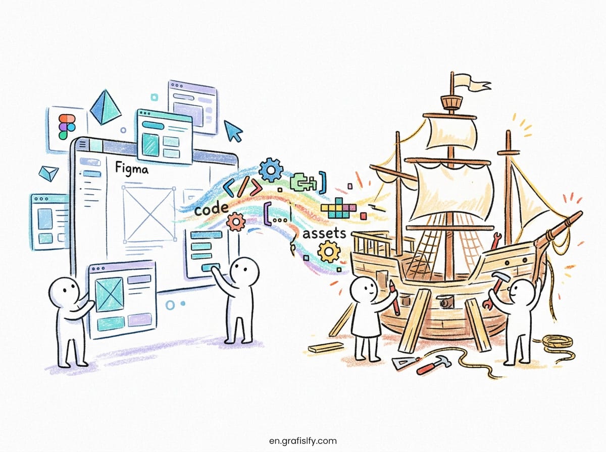
Design tokens emerged to bridge design tools and the codebase. Before tokens, a designer updated a color in Figma, took a screenshot, and the developer found every instance manually. That workflow is slow and guarantees drift. A token system flips the model: the design file and the code reference the same JSON source, so a color change flows through automatically. I have used this approach across multiple projects and the difference in consistency is night and day.

Global, Alias, and Component Tokens: The Three Layers
Most healthy token systems use three layers. Each layer has a distinct job, and mixing them is one of the most common causes of a broken design system.

Global Tokens
Global tokens are the raw primitives. They map one-to-one to an actual value with no semantic meaning. Examples include color.blue.500, space.4, and font.size.16. They describe the palette and scale you have, not what anything is for. A typical system starts with 20 to 50 global tokens covering the core palette, type ramp, and spacing scale.
Alias Tokens
Alias tokens, sometimes called semantic tokens, add meaning on top of globals. color.background.default points to a global, and color.background.inverse points to another. This layer is where the magic lives. When dark mode arrives, you remap alias tokens to a different set of globals instead of rewriting components. The alias layer also encodes accessibility: a token like color.text.onDark embeds contrast compliance by design.
Component Tokens
Component tokens bind aliases to a specific UI element. button.primary.background is a component token. They make components self-contained and easy to theme. Teams that keep this layer thin and rely mostly on aliases avoid the explosion of token names that plagues over-engineered systems. A lean system with around 200 tokens often outperforms one with 800 names that nobody remembers.
Also Read:
Comparison Table: Conventional Values vs Design Tokens
| Aspect | Conventional Hard-Coded Values | Design Token System |
|---|---|---|
| Visual Consistency | Low, prone to color and spacing drift | High, enforced through a single variable reference |
| Rebrand Speed | Slow, replace values file by file manually | Fast, update the token JSON in one place |
| Multi-Platform Support | Manual and isolated on web, iOS, and Android | Automated, generated from one source via CI |
| Dark Mode and Themes | Hard, duplicate components per theme | Simple, remap alias tokens at runtime |
| Onboarding New Developers | Slow, no shared vocabulary for values | Fast, token names document visual intent |
How to Move Tokens From Figma Into Code
This is where many token systems stall. The design file looks beautiful, but the values never reach the product. The reliable path runs through a tool like Style Dictionary, which reads a JSON token file and generates platform-specific output such as CSS custom properties, Swift, or Kotlin. Style Dictionary is open-source, actively maintained, and handles the heavy lifting of transforming token values into the correct syntax for each target platform.
The workflow is straightforward. Define your tokens in a structured JSON file in the repo. Run Style Dictionary as part of your build. Import the generated output into your app and reference the exported variables. When a designer updates a value, the pipeline regenerates everything with no copy-paste and no drift. A typical build takes under two seconds.
Figma’s native variables feature removes the last manual step. You sync Figma variables to the same JSON source, so the design tool and the codebase read from the identical file. Martin Fowler’s analysis of token-based UI architecture makes the point clearly: tokens are “design decisions as data,” and treating them as deployable artifacts unlocks automated code generation. Teams that reach this state stop shipping mismatched UI because there is nothing left to mismatch. I have seen this pattern ship across web and mobile simultaneously, removing the single biggest source of friction between design and engineering.

What Automation Unlocks for a Product Team
Once tokens flow through a pipeline, the benefits compound. A/B testing a new accent color becomes a config flag. Accessibility contrast can be validated against token pairs before anything ships, so you catch a low-contrast button in the build instead of in a user complaint. Tools can flag any alias token that falls below WCAG AA standards against its background, and the build fails before deployment.
Multi-brand companies benefit the most. Each brand becomes a separate token file that resolves to the same component layer. The product code stays identical while the tokens swap the entire look and feel. That is the difference between maintaining three separate apps and maintaining one app with three themes. I have watched teams reduce a six-week brand rollout to a single token-file update using this approach.
The operational win is equally real. New designers and engineers read token names to understand the system, so onboarding gets faster and tribal knowledge shrinks. A clear hierarchy lets a product team change direction without rewriting the foundation. When linting and validation run automatically, most consistency bugs are caught before they reach production.
Common Mistakes That Quietly Break a Token System
The failure modes are predictable, and I have watched almost all of them happen in real projects. Naming is the first. Teams use vague names like color.primary.light or duplicate values under two different names, and the system rots from ambiguity. Pick a consistent naming convention early and document it before anyone starts adding tokens.
Over-abstraction is the second trap. Adding a semantic layer for every single value creates hundreds of tokens that nobody can navigate. Start small. Define the global palette and a handful of aliases, then expand only when a real need appears. A lean system that is actually used beats a complete system that nobody trusts. I have seen teams build 600 tokens in a month and abandon the entire system because nobody could remember the naming convention.
Skipping the pipeline is the third and most expensive mistake. If tokens live only in Figma and never reach code, they are decoration. The entire value proposition depends on the automated handoff, so invest in that bridge before you invest in more tokens. Keep the structure simple and expand gradually. A token system without an automation pipeline is just a naming exercise with no real impact.
Final Thoughts and Next Steps
Design tokens are not a trend. They are the operational backbone of any product that wants to stay visually consistent while moving fast. The upfront cost is modest, and the payoff in rebrand speed, theme support, and team alignment is enormous.
Start with your color palette and spacing scale as global tokens, add a thin alias layer, and wire them into a pipeline so the design and the code never fall out of sync. If you are new to structuring a system, the way invisible design choices shape user experience is worth reading first, and good font pairing shows how the same discipline applies to typography. For a deeper look at tooling, comparing Figma AI and Adobe Firefly helps you decide which design stack fits your workflow.
I have seen design systems save teams weeks of rework, and I have seen them rot from poor naming and no pipeline. The difference is not talent. It is discipline. Set up your tokens, keep them simple, and let automation do the rest.

Irfan is a Creative Tech Strategist and the founder of Grafisify. He spends his days testing the latest AI design tools and breaking down complex tech into actionable guides for creators. When he’s not writing, he’s experimenting with generative art or optimizing digital workflows.




 Artificial Intelligent
 Design & Creative
 Freelance
 Gadgets & Gear
 Insights
 Laptop
 Reviews
 Smartphone
 Tech Guides
 Vibe Coding