Purposeful Motion: UI Animation That Builds Trust

The TL;DR Verdict
Users distrust interfaces that confirm too fast. A payment that clears in a blink, a password change acknowledged before you lift your finger, a form that says done before it could possibly be done: each one plants a small doubt. A beat of motion changes that. A visible processing state, a short deliberate pause, a confirmation animation that closes the loop, all of these tell the user that real work happened. Speed still matters everywhere else. The craft is knowing which moments deserve friction. This article breaks down where deliberate slowness earns trust, what the research actually says, and the rules I use to apply it in real products.

Fast Is Not the Same as Believable
Product designer Emil Kowalski ran a comparison that stuck with me. Two identical submit buttons. One changed state instantly: click, green check, done. The other introduced a half-second pause with a subtle processing state before confirming. People found the slower one more believable, as Tubik Studio recounts in their analysis of current interface trends. The quote is blunt: “Artificially delaying writes like form submissions can give your users more confidence that their changes went through,” as quoted by Tubik Studio.
The mechanism is simple psychology. For critical, infrequent actions like payments, password changes, and contact forms, instantaneous confirmation feels suspicious. Tubik puts it well: it feels “like the system didn’t even try.” Your brain expects effort to take time. When the interface skips the effort, trust drops, even though the underlying operation finished in milliseconds.
This cuts against a decade of optimization. Optimistic UIs trained users to expect everything instantly, and for high-frequency workflows like task managers or search tools, instant still wins. Nobody wants a half-second ceremony on every keystroke. The rebalancing happening now is about reserving friction for the moments where trust matters more than speed. Tubik’s summary line captures the whole shift: “Perceived reliability beats actual speed.”
I covered the mechanics of motion, duration, easing, and systems in my guide to motion design in UI/UX. This article goes one layer deeper: the psychology that decides whether motion builds or breaks trust.
Where a Little Friction Earns Trust
Designers are reintroducing three kinds of deliberate friction, and each one maps to a specific trust problem.
Also Read:
Visible loading states solve the “is it working” problem. A spinner or skeleton screen tells the user the system accepted the input and started the job. The Nielsen Norman Group describes skeleton screens as placeholder UI that looks like a wireframe of the loading page, animated by a light glare moving across it. The animation carries information: the page structure is coming, and the app did not freeze. NNGroup lists four advantages of progress indicators, including that they reduce the perception of time and reassure the user that the system is working.
Micro-delays that acknowledge input solve the “did it register” problem. A button that shows a brief pressed state before the action completes feels physical. The half-second pause Kowalski tested is the extreme version. A lighter version is a 200 to 300 millisecond transition that lets the eye register cause and effect. My piece on microinteractions in UI design goes deeper into these small feedback moments.
Confirmation animations that close the feedback loop solve the “did it finish” problem. A row that fades and slides before deletion confirms the action without a modal. A checkmark that draws itself after a payment says the money moved. Open loops create anxiety. Closing them with motion is the cheapest form of reassurance you can ship.

Notice what all three share. The motion explains what is happening, or it disappears. NNGroup states the principle clearly: “Instead of using animations to provide surface-level delight (that quickly sours), animations can be leveraged for usability: as clues about what is currently happening with the system.”
Speed vs Trust: How to Decide
Not every interaction deserves ceremony. The decision comes down to frequency, stakes, and reversibility. High-frequency, low-stakes, reversible actions stay instant. Infrequent, high-stakes, hard-to-reverse actions earn visible effort.
| Situation | Motion approach | Why it works |
|---|---|---|
| One-tap actions like saving or liking | Instant response, 150 to 250 ms transition | Flow stays unbroken; trust is already banked from repeated use |
| Payments and money transfers | Visible processing state, 500 ms or longer | Shows the system did real work before claiming success |
| Password and security changes | Confirmation sequence with a short pause | High stakes deserve visible effort |
| Form submissions | Brief delay, then a clear success state | Prevents the “did it go through” double-submit reflex |
| Loading long lists or reports | Skeleton screens; percent-done for waits over 10 seconds | Keeps attention and sets honest expectations |
| Destructive actions like deleting | Fade and slide out, then undo affordance | Confirms the action while keeping the escape hatch visible |
What the Research Says
The numbers behind this shift are older and more stable than the trend cycle suggests. Jakob Nielsen’s response time limits, maintained by NNGroup for decades, define three thresholds. At 0.1 second, users feel the system is reacting instantaneously, and no special feedback is needed. At 1.0 second, the user’s flow of thought stays uninterrupted, but beyond that limit the interface must show that the computer is working. At 10 seconds, attention breaks entirely, and the interface needs a percent-done indicator plus a way to interrupt.
Nielsen also noted the computer can be too fast. A scrolling list can move so quickly that the user cannot stop it in time, which is why interface changes should follow a real-time clock, and animation is one way to do that. Speed without pacing is a liability, not a feature.
On progress indicators specifically, NNGroup cites a University of Nebraska-Lincoln study: participants who saw a moving progress bar reported higher satisfaction and were willing to wait on average 3 times longer than participants who saw none. The guidance is concrete. Use an indicator for any action taking longer than about 1.0 second. Use a looped spinner only for actions in the 2 to 10 second range. Use a percent-done indicator for anything longer. And skip static progress indicators entirely, since they fail to reassure.
Google’s Material Design 3 motion system gives designers a calibrated vocabulary for these durations. Emphasized motion runs 500 ms when an element begins and ends on screen, 400 ms when entering, and 200 ms when exiting. Standard motion runs 300, 250, and 200 ms for the same cases. Duration scales with distance: small-area transitions stay short, large-area traversals run longer. The stated principle: “Transitions shouldn’t be jarringly fast or so slow that users feel as though they’re waiting.”
The web performance world converges on the same idea from the other side. Google’s Interaction to Next Paint metric rates responsiveness at the 75th percentile: 200 ms or less is good, 200 to 500 ms needs improvement, and beyond 500 ms is poor. Their guidance stresses that delayed visual feedback makes users think the page is not responding. The practical synthesis for designers: acknowledge every input within 200 ms, even with a skeleton or a pressed state, then let the honest work show itself at a human pace.
Rules for Motion That Earns Trust
These are the rules I apply when reviewing motion in a product. They work as a checklist for design reviews and as design tokens policy.
1. Acknowledge every tap within 200 ms. The acknowledgment can be a ripple, a pressed state, or a skeleton. The user should never wonder whether the tap registered. This is the floor. Everything below builds on it.
2. Spend your slowest animation on the highest-stakes action. Payments, publishing, and security changes get the full sequence. Likes, tabs, and toggles get the minimum. Budget slowness like a scarce resource, because user patience is one.
3. Close every loop. Any request that starts with motion should end with a visible resolution. A spinner that vanishes without a success state leaves the user guessing. The loop closes with a checkmark, a toast, or a settled layout.
4. Reserve friction for the infrequent and the irreversible. Daily actions stay instant. Rare or destructive actions earn ceremony. When in doubt, check the table above: frequency and reversibility decide.
5. Encode durations in tokens, not in components. Motion consistency breaks when every engineer picks their own easing curve. A small set of duration tokens, 200, 300, 500 ms with defined roles, keeps the whole product speaking one language. Calm visual hierarchy also gives motion room to breathe; a crowded layout makes even good animation feel noisy.
6. Honor reduced motion. Some users experience vestibular discomfort from animation. Respect the prefers-reduced-motion setting with a genuine no-animation path, not a faster version of the same sequence.
7. Never animate to hide latency. Animate to explain it. A spinner on a broken request is a lie with good timing. Skeleton screens and honest progress indicators respect the user. Decoration that masks failure always backfires.
Key Takeaways
- Perceived reliability beats actual speed for critical, infrequent actions like payments, security changes, and form submissions.
- Three friction patterns earn trust: visible loading states, micro-delays that acknowledge input, and confirmation animations that close the loop.
- Research-backed thresholds: 0.1 s feels instant, 1.0 s needs feedback, 10 s needs a percent-done indicator; moving progress bars make users willing to wait 3 times longer.
- Material Design 3 calibrates UI motion between 200 and 500 ms, scaled to the distance the element travels.
- Reserve slowness for high-stakes, infrequent, hard-to-reverse actions. Keep everyday interactions instant.
The Bottom Line
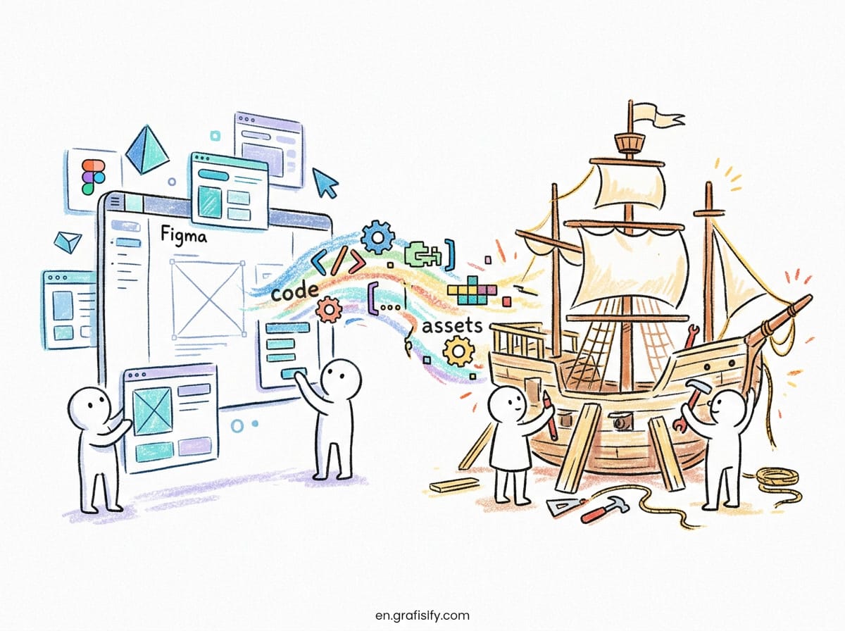
The goal was never slow interfaces. The goal is interfaces that feel honest. Every animation is a small promise about what the system is doing. Keep those promises, spend your friction where trust is on the line, and cut every frame that exists only to show off. Audit one critical flow this week, a payment, a signup, a publish button, and ask a simple question: does the motion explain the work, or does it just decorate the wait? The answer will tell you exactly what to fix. For a broader look at how small details shape perception, my microinteractions guide and the Figma to code workflow article pick up where this one leaves off.
Tagged with:
design systemsinterface designmicrointeractionsmotion designUI animationuser trustUX psychology
Irfan is a Creative Tech Strategist and the founder of Grafisify. He spends his days testing the latest AI design tools and breaking down complex tech into actionable guides for creators. When he’s not writing, he’s experimenting with generative art or optimizing digital workflows.





 Artificial Intelligent
 Design & Creative
 Freelance
 Gadgets & Gear
 Insights
 Laptop
 Reviews
 Smartphone
 Tech Guides
 Vibe Coding