W3C Design Token Format: What Changed and Why It Matters

Verdict: The Short Version
Design tokens finally have a shared file format. The W3C Design Tokens Community Group shipped version 2025.10 on October 28, 2025, the first stable release of a vendor-neutral format backed by more than 40 organizations, including Adobe, Figma, Google, Microsoft, Shopify, and Salesforce. A token file written in this format can move between Figma, Penpot, Sketch, Tokens Studio, Style Dictionary, and Terrazzo without a custom parser for each hop.
If you run a design system today, the practical move is simple. Keep your current toolchain, but write new tokens in the DTCG shape: every token gets a $value and a $type, aliases use the {group.token} syntax, and raw values live in one primitive layer that semantic tokens reference. I recommend starting with color and spacing, because those two groups carry most of the rework when a brand changes. The rest of this article explains the format, the three-tier structure that makes it useful, the toolchain around it, and a migration path that fits in a single sprint.

What Design Tokens Are
A design token is one design decision stored as named data. A color, a spacing step, a type size, a corner radius, a shadow, a motion duration. Instead of hardcoding #2563eb into a stylesheet and retyping it in an iOS codebase, you store it once under a name like color.action.primary and let each platform read that name.

The term itself comes from Salesforce. Designer Jina Anne coined it in 2014 while the Lightning Design System team needed the same decisions to reach web, iOS, Android, and partner platforms without anyone retyping hex values. Their open-source tool Theo was the first token build system, and every modern pipeline descends from it.
Tokens are often confused with variables, so the distinction deserves a clear line. A CSS variable, a Sass variable, or a Figma variable is one implementation of a token on one platform. The token lives upstream: a named decision in a data file that gets transformed into whatever each platform needs. Variables are the delivery mechanism. Tokens are the decision.
That distinction explains why tokens matter beyond convenience. A hardcoded hex value is a fact buried in code. A token is a decision with a name, an owner, and a history. When a brand refresh lands, you change the token value in one place and every surface that references it updates. When a designer and a developer argue about a shade of blue, they argue about a named token, not about a string of characters in a file neither of them owns.
The DTCG Format in Plain Terms
Before the DTCG format, every tool stored tokens in its own dialect. Figma exports looked one way, Style Dictionary configs another, and a team moving between tools wrote glue code to translate. The DTCG format standardizes the shape of a token file so tools can read and write the same file.
Every token is a JSON object with a required $value. A $type says what kind of value it holds: color, dimension, fontFamily, fontWeight, duration, cubicBezier, shadow, typography, and more. A $description holds a human-readable note. A $extensions key holds tool-specific metadata, namespaced so tools never collide. The $ prefix is deliberate: it separates spec-defined keys from token group names, so you can nest tokens freely without naming conflicts.
Here is the shape in practice:
{
  "color": {
    "brand": {
      "primary": {
        "$value": "#2563eb",
        "$type": "color",
        "$description": "Primary action color"
      }
    }
  },
  "button": {
    "background": {
      "$value": "{color.brand.primary}",
      "$type": "color"
    }
  }
}
The alias in that example does the heavy lifting. {color.brand.primary} points at the base color instead of duplicating the hex value. Change the base color once and every token that references it updates, in any tool that reads the format, without a custom resolution step per destination.
Two details keep the format honest. First, the 2025.10 release is a Final Community Group Report, not a W3C Recommendation, the document class a web standard like CSS becomes. Treat it as a stable community standard with broad industry backing, not as a browser-grade specification. Second, the spec recommends the .tokens and .tokens.json file extensions, served as application/design-tokens+json, with plain application/json also accepted.
For a deeper reference on the format itself, the DTCG format guide on Livery walks through the token shape, the type list, and the alias syntax with worked examples. The analysis by Luis Vargas covers what the 2025.10 release standardizes and what it leaves to your pipeline.

Three Tiers: Primitive, Semantic, Component
The format defines how tokens are written. It does not tell you how to organize them. The working pattern across mature design systems is three tiers, and the alias syntax exists to make this pattern possible.
Primitive tokens encode the raw material: every color step, every spacing value, every radius. They carry context-free names like blue.600 or space.16. Nobody applies a primitive token directly to a component. Semantic tokens encode intent: the background color for a danger callout, the spacing between list items, the radius for a card. They reference primitives through aliases. Component tokens encode per-component overrides for teams that need them, such as a button that needs a tighter radius than the card default.
| Tier | What it holds | Example | Who changes it |
|---|---|---|---|
| Primitive | Raw values, full palette and scale | color.blue.600: #2563eb | Design lead, during a rebrand |
| Semantic | Intent, mapped to primitives | color.action.primary: {color.blue.600} | Design system team |
| Component | Per-component overrides | button.radius: {radius.sm} | Component owner |
The tier split pays off in two moments. A rebrand touches primitives only, and semantic tokens carry the new palette everywhere without a single component edit. A dark theme touches semantic tokens only: surface.background points at a dark primitive in dark mode and a light primitive in light mode, while components keep referencing the same semantic name. I have seen teams skip the semantic layer and alias components straight to primitives, and the result is always the same: a theme change becomes a search-and-replace across hundreds of files, which is the exact problem tokens exist to solve.
Naming deserves the same discipline as the structure. Primitive names stay value-based, because the value is the point. Semantic names stay purpose-based, because the purpose is the point. A semantic token named blue-button breaks the moment the button turns green. A semantic token named action.primary survives any palette change. Keep names short, lowercase, and dot-separated, and write the naming rules down before the token count passes fifty.
Figma Variables, Style Dictionary, and the Toolchain
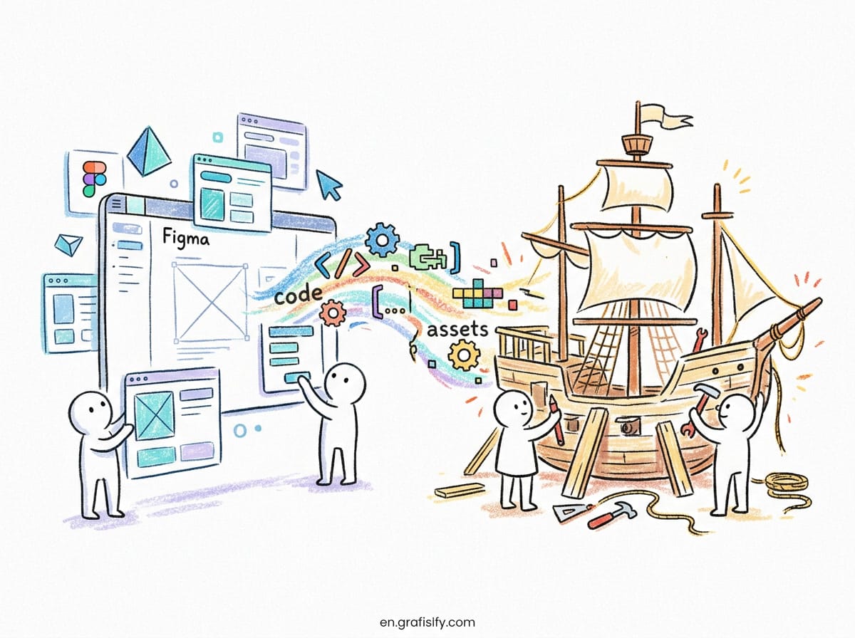
The toolchain has settled into three layers: Figma Variables where designers work, a version-controlled token file as the source of record, and Style Dictionary as the build step that turns one source into every platform format.
Figma Variables are the design-side implementation of tokens. They come in four types, color, number, string, and boolean, organized into collections, with aliasing so a semantic variable can reference a palette variable and modes so one collection can hold parallel value sets for light and dark themes. That maps cleanly onto the three-tier pattern: one collection for primitives, one for semantic tokens with light and dark modes. One caveat matters for budgeting: publishing variables to team libraries requires a paid Figma plan. Adoption is already broad. Supernova’s State of Design Tokens report found 69.8 percent of design teams already working with Figma Variables.
Style Dictionary is the build step. Version 4 treats the DTCG format as a first-class input: point it at a DTCG-formatted token file and it parses $value, $type, and $description natively, resolves aliases, and runs the values through transformers that emit CSS custom properties, iOS asset catalogs, Android XML resources, or any format your platforms need. Terrazzo covers the same role for teams that prefer its pipeline. The Codercops guide to the 2026 format explains how the two build tools read DTCG files directly and what migration from older shapes involves.
Tokens Studio, the Figma plugin formerly known as Figma Tokens, closes the gap Figma Variables still leaves. It manages tokens inside Figma while syncing them to a Git repository, GitHub, GitLab, Bitbucket, or Azure DevOps, and exports through Style Dictionary. If your source of record must live in version control with pull requests and review, Tokens Studio is the usual answer. The practical guide on The Masterly compares the three layers and lists the seven mistakes that kill token adoption, which is worth reading before you commit to a setup.
Dark mode is the feature that sells tokens to skeptical teams, and it connects directly to the rest of a design system. Our guide to dark mode design rules covers the contrast and readability decisions that semantic color tokens make easy to enforce, and the WCAG contrast cheat sheet lists the exact ratio thresholds your color tokens must satisfy.
Migrating an Existing Setup to the DTCG Format
Migration is mechanical, and that is good news. Wrap each token value in a $value key, add a $type, and convert references to the dot-path alias syntax. Style Dictionary v4 reads both the old shape and the DTCG shape, so you can migrate in stages instead of one big rewrite.
Start with an audit. Export your current tokens and count them by type. Most teams find three surprises: duplicate values with different names, tokens nobody references, and colors defined as raw hex in components that bypass the token layer entirely. Delete the dead tokens before migration, because migrating clutter just gives you standardized clutter.
Next, split your flat token list into the three tiers. Primitives take the raw values. Semantic tokens take the names components actually use. Component tokens take the exceptions. This split is the real work of migration, and it forces decisions that a flat list lets you dodge. Expect arguments about naming. Settle them with a short written guide, not with a meeting that revisits the same names every month.
Then wire the pipeline. Keep the token file in Git as the source of record. Run Style Dictionary in CI so every token change produces fresh platform outputs and a failing build when a token reference breaks. Export Figma Variables to the same DTCG file, or sync through Tokens Studio, so design and code read one file. The Atomize guide to Figma design tokens walks through the collection setup step by step, including the export to JSON and the spacing scale values that work well as a starting point.
Typography tokens deserve a note of their own. Font choice interacts with token structure, because a type scale is a set of related decisions, not one value. Our font pairing guide explains how to pick typefaces that work together, and those pairings map neatly onto fontFamily and typography tokens once the scale is set. Keep the type scale small: four to six sizes cover most interfaces, and every extra step is a decision someone must maintain.
When Design Tokens Are Overkill
Tokens solve a coordination problem. If one designer and one developer ship one website, a shared stylesheet with CSS variables does the same job with less ceremony. Tokens earn their keep when the same decisions must reach more than one platform, more than one brand, or more than one theme.
A solo portfolio site does not need a token pipeline. A marketing site with a single theme does not need component tokens. A prototype that will be thrown away next week does not need any of this. The cost of tokens is real: a build step, a naming system, a source of record, and a review process for changes. Pay that cost when inconsistency already hurts, not in anticipation of a scale you may never reach.
Small teams can still borrow the idea without the machinery. Name your colors by purpose in your CSS variables, keep one scale for spacing, and document the scale in a short comment block. That is a token system with a lowercase t, and it migrates cleanly into the DTCG format later because the naming discipline is already there. The format is a file shape, not a mandate. Adopt the shape when the team around it needs it.
One more honest limit: tokens do not fix bad design decisions. A token named action.primary that points at a color with poor contrast is still a poor choice, just a consistently applied one. Pair token work with the same quality checks you would apply to any interface, including image format choices that affect load time. Our comparison of AVIF vs WebP vs PNG covers the format tradeoffs that sit next to token decisions in a performance budget.
Conclusion: Start With Five Tokens
The DTCG format gives design tokens something they lacked for a decade: a shared file shape that tools can read and write without custom translation. Version 2025.10 is stable, backed by the largest design tool vendors, and already supported by Style Dictionary v4 and Figma Variables export. The format itself is small, four keys and an alias syntax, and the discipline around it is what matters: primitives hold raw values, semantic tokens hold intent, component tokens hold exceptions.
If you want a starting point that fits in one week, pick one product surface and tokenize its colors and spacing only. Put the file in Git, run Style Dictionary in CI, and ship a dark theme using modes or semantic aliases. Measure the result by the next brand tweak: if it lands as a one-line token change instead of a week of edits, the system works. Then extend it to typography and motion, one group at a time.
Our earlier guide, Design Tokens: How to Build a System That Scales, covers the organizational side of running a token system across teams. Read it next if the format questions are settled and the people questions are next. Then open your token file, pick the five most duplicated hex values in your codebase, and turn them into tokens this week. That small start is the whole method: name the decision once, reference it everywhere, and let the format carry it to every platform you ship on.

Irfan is a Creative Tech Strategist and the founder of Grafisify. He spends his days testing the latest AI design tools and breaking down complex tech into actionable guides for creators. When he’s not writing, he’s experimenting with generative art or optimizing digital workflows.



 Artificial Intelligent
 Design & Creative
 Freelance
 Gadgets & Gear
 Insights
 Laptop
 Reviews
 Smartphone
 Tech Guides
 Vibe Coding