Dark Mode Design: Rules for Interfaces That Stay Readable
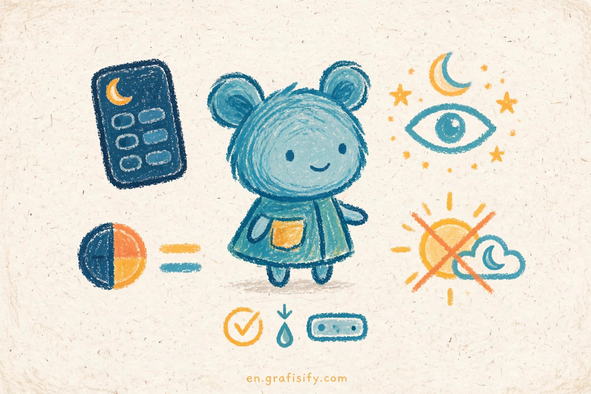
Dark mode looks simple from the outside. You flip a switch, the background turns dark, and the job looks done. It is not done. A good dark theme is a second design system with its own colors, its own depth rules, and its own contrast checks. This guide covers the rules that keep dark interfaces readable, calm, and consistent.
Verdict: Treat Dark Mode as a Second Design System
Do not invert your light theme and ship it. Inverted colors break hierarchy, wash out accents, and push text contrast below readable levels. Build a separate palette for dark surfaces, test every text color on every surface it sits on, and give users a manual toggle next to the system setting. If you do only three things, do these: start from dark gray instead of pure black, desaturate your accent colors, and check contrast on cards and inputs, not only on the page background.
That sounds like extra work, and it is. The payoff is a theme people can read at midnight without squinting, and a product that looks intentional in both modes. The rest of this guide walks through each decision in order, from background color to the final pre-ship check.
Start With Dark Gray, Not Pure Black
Pure black paired with pure white text creates the highest possible contrast, and that is the problem. The jump from #000000 to #FFFFFF strains the eyes during long reading sessions, and on OLED screens it can produce a smearing effect while scrolling. Google Material Design uses #121212 as its dark theme baseline for exactly this reason: a very dark gray keeps the screen dark while leaving room for depth.

A dark gray baseline also gives you a working range. Shadows disappear on pure black because a shadow is a darker shape, and nothing is darker than black. On #121212, you can still show depth with lighter surfaces, thin borders, and subtle top highlights. Apple takes a similar path on iOS, where the system background in dark mode is a dark gray rather than true black, and apps that respect the system colors get that behavior for free.
Pick one background value and stick to it across screens. If your marketing site uses #121212 and your app uses #0A0A0A, users notice the seam even when they cannot name it. A small tint helps too: a background with a faint blue or warm undertone feels less flat than a neutral gray, and it ties the dark theme back to your brand. Keep the tint subtle. The background should stay in the background.


Build a Surface Ladder for Depth
Light themes show depth with shadows. Dark themes show depth with lighter surfaces. The rule is simple: the closer an element sits to the user, the lighter its surface. A card on the page background is one step lighter. A dropdown on that card is another step lighter. A modal on top of everything is lighter still.
Material Design formalized this as elevation overlays, in its dark theme guidance. In the classic Material system, a surface at 1dp gets a 5 percent white overlay over the #121212 base, which lands near #1E1E1E. At 8dp the overlay reaches 12 percent, near #2E2E2E, and at 24dp it reaches 16 percent, near #383838. You do not need to copy those exact numbers, but you need the same discipline: a fixed ladder with three to five steps, used the same way on every screen.
Two extra tools complete the depth system. A 1px border, 5 to 10 percent lighter than the surface it frames, draws a clean edge around cards and inputs. A faint top edge highlight suggests light catching the top of a raised element. Most strong dark themes combine all three: lighter surfaces for cards, borders for containers, and top highlights for buttons and menus. If your interface looks flat, the cause is usually a missing ladder, not a wrong accent color.

Keep the ladder short. Ten surface values invite drift, and drift is how one screen ends up with five grays that look identical. Three to five steps cover background, raised, overlay, and modal states for most products. Name them in your design tokens so the whole team uses the same values.
Desaturate Color Before It Vibrates
Brand colors built for white backgrounds misbehave on dark ones. A saturated blue or red that looks crisp on white can appear to vibrate against a dark surface, and saturated text on dark backgrounds often fails contrast checks even when it looks bright. The fix is to desaturate: pull the same hue toward gray and lift its lightness until it reads clearly without shouting.
Work from your light palette, not from scratch. Take each brand color, lower its saturation by roughly a third, and test it as text, as an icon, and as a button fill on your darkest surface. Colors that pass as large fills often fail as small text, so test both sizes. Accent colors deserve restraint in dark mode. Use them for actions, links, and small highlights, and let surfaces and text carry the rest of the screen. A dark interface with three loud accents looks like a warning panel. One accent, used consistently, looks like a product.

Error and success states need the same treatment. A pure red error message on dark gray is harsh and hard to read. A lighter, softer red keeps the meaning and stays legible. The same goes for success green and warning amber: lighter and less saturated beats brighter and louder. If your brand color cannot reach readable contrast in its dark form, use a lighter tint for text and keep the pure brand color for large fills and logos only.
Treat Text Contrast as a Per-Surface Check
WCAG AA asks for a contrast ratio of at least 4.5 to 1 for normal text and 3 to 1 for large text, and those numbers apply to dark mode exactly as they do to light mode. The trap is testing once against the page background and stopping there. Secondary text on a card, placeholder text in an input, and disabled labels on an elevated surface all sit on different backgrounds, and each pairing needs its own check. For a deeper reference on the ratios, the W3C contrast minimum guidance states the thresholds plainly.
Use an opacity scale for text instead of inventing a new gray for every level. Material Design uses white at 87 percent for high emphasis text, 60 percent for medium emphasis, and 38 percent for disabled text on dark surfaces. That scale preserves hierarchy without extra colors, and it maps cleanly to design tokens. For a practical walkthrough of the same ratios, I recommend the WCAG contrast ratios cheat sheet on this site, which pairs each ratio with examples you can test against your own palette.
Three spots fail most often, so check them first. Placeholder text inside inputs is usually too dim. Timestamps, captions, and helper text sit below the ratio on cards. Focus rings disappear when they rely on a shadow that dark backgrounds swallow. I check those three on every screen before I call a dark theme done, because they are the spots users hit in real tasks, not in hero mockups.
Do not rely on color alone to carry meaning either. A red border plus an error message beats a red border by itself, and an icon plus a label beats either one alone. This matters for readers with color vision deficiency, and it also helps everyone scanning a dense screen at low brightness.
Dark Mode vs Light Mode: What Changes and What Stays
A theme switch changes more than the background. The table below lists the decisions that actually shift between modes, so you can review your own theme against it.
| Element | Light mode | Dark mode |
|---|---|---|
| Background | White or near white | Dark gray such as #121212 |
| Body text | Near black | White at about 87 percent opacity |
| Depth cue | Shadows | Lighter surfaces, borders, top highlights |
| Accent color | Full saturation brand color | Desaturated, lighter tint of the same hue |
| Images | Shown as is | Dimmed slightly or given a dark backdrop |
| Borders | Light gray lines | Thin lines slightly lighter than the surface |
| Focus state | Dark outline or shadow | Bright outline with strong contrast |
What stays the same matters as much as what changes. Spacing, type scale, layout, and interaction patterns should not shift between modes. If a button moves or a heading changes size when the theme flips, users lose their place. Theme switching should feel like the lights going down in the same room, not like walking into a different building. That stability is also why purposeful motion matters during the switch itself: a short, calm crossfade keeps users oriented, while an instant flash feels like a glitch.
Images, Icons, and Borders Need Their Own Pass
Photos with white backgrounds look broken on dark screens. A product shot on a white field becomes a glowing rectangle floating on your carefully tuned gray. The fixes are practical: prefer transparent assets for logos and icons, dim photos slightly with a dark overlay, or place photos on a card whose surface matches the image treatment. The AVIF versus WebP versus PNG comparison on this site helps here too, since format choice affects how clean those transparent assets look at small sizes.
Icons need a dark pass as well. Thin strokes that read fine on white can vanish on dark gray, and icons drawn in pure brand colors vibrate the same way text does. Test your icon set at 16 and 24 pixels on the darkest surface, and keep a filled variant for low contrast situations. Small details carry outsized weight in dark mode, which is why the microinteractions guide on this site pairs well with this one: the states you polish in light mode still need their dark equivalents.
Borders deserve a deliberate value, not a leftover. A border copied from light mode is usually too dark to see on a dark surface, which makes cards melt into the background. Set a border token per surface step, roughly 5 to 10 percent lighter than the surface it frames, and use it everywhere. Consistent borders quietly do the job that shadows used to do.
One more pass: illustrations and charts. Chart libraries often ship light defaults, so gridlines, axis labels, and legend text need dark values too. A chart that keeps its light gridlines on a dark card is a common ship blocker, and it is easy to miss because charts sit below the fold in most reviews.
Conclusion: Ship a Dark Mode Checklist
Dark mode rewards systems thinking. One background, one surface ladder, one text scale, one desaturated accent, and contrast checks on every surface. That is the whole system, and it fits on a sticky note. Before you ship, run this check on three real screens, not mockups: read the smallest text on the darkest card, tab through the form with a keyboard to see the focus ring, and switch themes mid-task to confirm nothing moves or flashes.
Start with the screen your users see most, and fix the palette there first. Then roll the tokens out to the rest of the product. If you want a second opinion on your own values, run your palette through a contrast checker and compare it against the ratios in this guide, then test it on a real phone at low brightness. Screens lie in bright offices. Your users read in bed, on trains, and in dim rooms, and a dark theme built for those rooms earns its keep every night.
For more on the performance side of shipping themes, the WordPress speed guide covers the asset and caching habits that keep a two theme site fast. And for the platform rules behind the values in this article, Apple documents its own approach in the Human Interface Guidelines dark mode section, Toptal collects the classic pitfalls in its dark UI design principles, and LogRocket compares how the major systems handle it in its dark mode UI best practices roundup.

Irfan is a Creative Tech Strategist and the founder of Grafisify. He spends his days testing the latest AI design tools and breaking down complex tech into actionable guides for creators. When he’s not writing, he’s experimenting with generative art or optimizing digital workflows.





 Artificial Intelligent
 Design & Creative
 Freelance
 Gadgets & Gear
 Insights
 Laptop
 Reviews
 Smartphone
 Tech Guides
 Vibe Coding