Font Pairing for Web Design: A Practical Guide
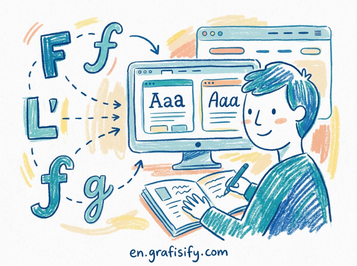
Why Font Pairing Matters More Than You Think
Typography is the first thing a visitor notices, even when they cannot name it. Two fonts that clash quietly undermine the whole design. Headings that overpower the body text, a mix that reads as accidental, spacing that feels off. These small failures add up to a site that looks amateur.
The real cost is trust. A study on readability and perceived credibility found that users form a first impression of a page in under a second, and typography drives much of that judgment. When the type looks unpolished, people assume the content is unpolished too. They bounce before reading a word you wrote.
The good news is that font pairing is a skill you can learn, not a talent you are born with. This guide gives you a repeatable method plus tested combinations you can put to work right away. By the end you will stop guessing and start choosing fonts with intent. You will also know why some pairings fail, so you can avoid the same trap on every future project.
The Three Rules That Cover Almost Everything
Designers overcomplicate typography. Three principles handle the vast majority of situations, from a portfolio site to a SaaS dashboard.
Rule 1: Contrast, not conflict. Pick fonts different enough that the reader can tell them apart, but not so different that they visually fight. A sharp serif like Playfair Display paired with a clean humanist sans like Inter contrasts well. Two geometric sans-serifs like Montserrat and Poppins together look like a mistake, because they are too similar in proportion to justify being separate.
Rule 2: One voice, one job. Give each font a clear role. Typically one display font for headings that sets the tone, and one body font that stays neutral so people can read without friction. Do not use both for both. The reader should never wonder which font is the heading. When you assign a single voice to each typeface, hierarchy becomes automatic.
Rule 3: Two is enough. More than two typefaces on a page is almost always a mistake outside of magazine design. If you need variety, use weights and sizes within your two fonts. Display at 700, display at 400 italic, body at 400, body at 600. That gives you range without adding fonts. This is the simplest rule and the one people violate most often.

How to Choose Font Pairings: A Repeatable Method
Most guides hand you a list of pretty combos and leave it there. You need a system you can run on any project, whether you are designing a landing page or a multi-page brand site.
Step 1: Define each font’s role before you browse. There are four common roles: display for large headlines, body for paragraph text, UI for buttons and labels, and accent for occasional emphasis. Most projects only need two: headline and body. Start with the body font. It carries the most content and decides readability. Choose it first, then find a heading font that complements it. Never pick both at once, because doing so makes it tempting to pick two striking fonts that compete for attention.
Step 2: Create contrast without creating conflict. Use these levers: serif versus sans, weight differences, width differences, size hierarchy, and texture. Avoid fonts that are too similar. Two geometric sans fonts with similar proportions clash subtly. A good rule of thumb is that if two fonts belong to the same category, adjust at least two contrast variables. One change is rarely enough to make the pairing feel deliberate.
Also Read:
Step 3: Check compatibility in 60 seconds. Does the x-height feel balanced? Are the apertures similarly open or intentionally contrasted? Is the stroke contrast harmonious? Does the paragraph rhythm feel consistent? Are italics and multiple weights available? Does it support the languages you need? Run these checks before committing and you will catch most bad pairings early. Most of these checks take seconds, and they prevent weeks of subtle discomfort for your readers.
Font Pairing Comparison Table
| Pairing Style | Best For | Heading Font | Body Font |
|---|---|---|---|
| Serif + Sans-serif | Editorial, agencies, long-form | Playfair Display | Inter |
| Display + Neutral sans | SaaS, product pages | Space Grotesk | Inter |
| Matched family | Simple, consistent brands | DM Serif Display | DM Sans |
| Condensed bold + Sans | Sports, news, action brands | Bebas Neue | Work Sans |
| Serif + Humanist | Personal branding, portfolios | Fraunces | Inter |
| Screen serif + Sans | News, educational blogs | Merriweather | Lato |
| Mono + Sans | Developer docs, code blogs | JetBrains Mono | Inter |
The table groups combinations by use case so you can match a pair to the job at hand. When in doubt, a serif heading with a neutral sans body is the safest starting point for professional work. It reads as classic and rarely offends, which is exactly what you want when the stakes are high.
12 Proven Google Font Combinations
These come from real design workflows and are free to use through Google Fonts. Add the display font to your headings and the body font to your paragraph text. Each pairing has been used widely enough that you can trust the spacing and legibility.

Playfair Display + Inter. High-contrast modern serif with a neutral humanist sans. The default choice for editorial sites, agencies, and personal branding. Works for almost any subject. The serif carries elegance in large sizes, and Inter keeps long paragraphs comfortable to read.
Space Grotesk + Inter. A geometric display sans with subtle quirks paired with a workhorse humanist. Modern, tech-forward, slightly playful. Great for developer tools and SaaS products that want personality without sacrificing clarity.
DM Serif Display + DM Sans. A matched family designed together by the same foundry, so the proportions align naturally. The serif has elegant contrast, the sans is clean and neutral. Harmonious without being boring. This is the easiest pairing to deploy because it was built as a set.
Fraunces + Inter. A soft serif variable font with real charm at display sizes, paired with Inter for readability. Good for brands that want personality without being weird. Fraunces has an old-style feel with modern edges that make headlines memorable.
Bebas Neue + Work Sans. A condensed bold display with a clean sans. Punchy and magazine-style. Best for sports, news, and action-oriented brands where energy matters more than subtlety.
Archivo Black + Archivo. An ultra-bold display paired with its sibling regular weight. Confident and slightly industrial. Works for B2B and bold editorial where you want the headlines to command attention.
Lora + Open Sans. Lora is a well-balanced serif built for screen reading, and Open Sans is one of the most used body fonts on the web. Classic, safe, very readable. This pairing shines for blogs and news sites where the content is the star.
Poppins + Roboto. Two popular sans-serifs that work because their personalities differ. Poppins is geometric and round, Roboto is neutral with a slight humanist lean. Friendly and familiar, a good pick for consumer apps and marketing pages.
Cormorant Garamond + Proza Libre. An elegant classical serif with a contemporary sans. Luxurious without being stuffy. Good for fashion, lifestyle, and high-end brands that want a refined, expensive feel.
JetBrains Mono + Inter. A developer-focused pairing. Mono headlines give immediate technical context, and Inter keeps the body readable. Great for docs and code blogs where a technical identity is a feature, not a bug.
Libre Baskerville + Source Sans 3. A web-optimized revival of Baskerville with Adobe’s Source Sans. Feels like a modern printed book on screen. Ideal for long-form writing and anything that wants a literary tone.
Unbounded + Inter. A modern display sans with flared strokes, bold and expressive. Paired with a neutral Inter body so the personality stays at the top. Great for creative agencies and portfolios where the work needs a distinct signature.
Common Mistakes That Make Your Site Look Amateur
You can avoid most typography failures by watching for a few repeating errors. These are the issues I see most often when reviewing design work, and they are all fixable in minutes.
Too many fonts. Three typefaces on a page confuse the hierarchy. Keep it to two and use weight and size for variety. Every extra font adds visual noise and slows the page down with extra requests.
Two fonts that are too similar. If the reader cannot tell them apart, the pairing adds nothing. Pick fonts with visible contrast in shape, weight, or width. A pairing that is invisible is a pairing that does not exist.
Thin weights for small text. Light fonts at 14 pixels are hard to read, especially on mobile. Save thin weights for large display type where the strokes have room to breathe.
Ignoring performance. Every font file is about 30 to 80 kilobytes. Eight weights of two fonts is close to 500 kilobytes of typography, more than a typical hero image. Use font-display: swap to avoid invisible text flashes, and prefer variable fonts when you can. A variable font covers multiple weights in a single file, cutting load time dramatically.
Mismatched optical sizes. A font built for print headlines can look weak at tiny body sizes. When available, use the optical size axis or pick fonts designed for screen at the size you actually need.
Key Takeaways
Good font pairing comes down to contrast and clear roles. Give each font one job, keep the pair to two families, and make the difference between them obvious.
Start your next project by choosing the body font for readability, then build the heading treatment around it. Run the 60-second compatibility check against x-height, apertures, and stroke contrast before you commit. Keep performance in mind with variable fonts and limited weights.
You do not need a huge collection of fonts. You need two that work well together and a reliable method for choosing them. Apply these principles once and the amateur look disappears. The next time you open a font picker, you will know exactly what to look for instead of hoping a random combination lands.

Irfan is a Creative Tech Strategist and the founder of Grafisify. He spends his days testing the latest AI design tools and breaking down complex tech into actionable guides for creators. When he’s not writing, he’s experimenting with generative art or optimizing digital workflows.


 Artificial Intelligent
 Design & Creative
 Freelance
 Gadgets & Gear
 Insights
 Laptop
 Reviews
 Smartphone
 Tech Guides
 Vibe Coding