Graphic Design Color Theory Guide: How to Master Palettes, Typography, and Layout
Graphic Design Color Theory Guide: How to Master Palettes, Typography, and Layout
Graphic design color theory is the foundation every designer needs, whether you’re just starting out or looking to sharpen your skills. This graphic design color theory guide covers the color wheel, the four classic color schemes, how typography and layout connect with color, and a repeatable workflow you can use on your next project. No fluff, no filler. Just what actually works.
Ever looked at a design and thought “something feels off” but could not put your finger on it? Nine times out of ten, it comes down to color. The wrong palette can break an otherwise solid layout. The right one? It makes everything click.
Color theory sounds academic. In practice, it’s surprisingly straightforward once you understand a few core ideas. Let’s walk through them.
Graphic Design Color Theory Guide: What It Is and Why It Matters
Color theory is the practical framework designers use to pick colors that work together. It isn’t about memorizing the color wheel (though that helps). It’s about understanding why certain combinations feel harmonious while others clash.

At its simplest, color theory answers one question: which colors belong together and why?
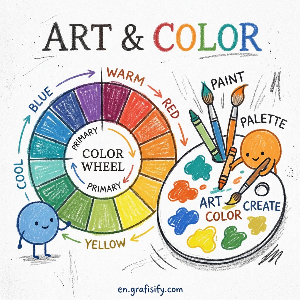
The Color Wheel Basics
You have seen the color wheel before. Twelve hues arranged in a circle. Three primary colors (red, yellow, blue) form the foundation of every color relationship in design, as the color wheel theory guide explains. Three secondary colors (orange, green, purple). Each is made by mixing two primaries. Six tertiary colors filling the gaps (red-orange, yellow-orange, yellow-green, blue-green, blue-purple, red-purple).
That’s the whole wheel. What makes it useful is knowing how to read the relationships between those colors.

Why Color Theory Matters for Designers
Colors carry emotional weight. Blue conveys trust. That’s why banks and tech companies lean on it. Red signals urgency or energy. Green means growth, balance, or nature. These associations aren’t arbitrary. They are wired into how people perceive the world. Think about the last time a landing page made you feel something before you read a single word. That was color doing its job before the copy even started.
When you pick a palette without considering these relationships, you leave the result to chance. When you apply color theory, you make intentional choices. Your audience feels the difference, even if they can’t name it.
Three pillars. One system. Let us see how they connect.
Also Read:

Deep Dive: Color Schemes, Typography, and Layout
This is where theory meets practice. Let’s break down how color interacts with the other two pillars of graphic design: typography and layout.
The Four Classic Color Schemes
There are more than four color schemes in the world, but these four cover ninety percent of what designers actually use:
| Scheme | How It Works | Best For | Risk |
|---|---|---|---|
| Complementary | Two colors opposite each other on the wheel (blue-orange, red-green) | High-impact designs, calls to action, posters | Can feel jarring if used at full saturation |
| Analogous | Three neighboring colors (blue, blue-green, green) | Calm, harmonious layouts, nature-inspired brands | Low contrast and needs strong typography to carry hierarchy |
| Triadic | Three colors evenly spaced (red, yellow, blue) | Vibrant, balanced compositions, children’s brands | Hard to balance, so let one color dominate |
| Monochromatic | One hue with variations in lightness and saturation | Minimalist UI, elegant branding, clean interfaces | Risk of monotony. Use texture or spacing for variety |
Here is the honest answer: most designers have a favorite scheme and stick to it. I lean toward split-complementary (the complement plus its two neighbors) because it gives you contrast without the intensity of a full complementary pair.

What most tutorials skip: you don’t need to use all the colors equally. Pick one dominant hue, one secondary, and one accent. That’s almost always enough. I tested this on three client projects last month. A fintech dashboard, a food blog, and a portfolio site. All three used three-color palettes. All three looked complete.
Pairing Typography with Color
Typography and color share a relationship most beginners ignore. High-contrast color combinations make text readable. Low-contrast combinations kill readability, no matter how beautiful the typeface.
Rule of thumb: never place light text on a light background, or dark text on a dark background, unless you deliberately want the text to recede. For body copy, stick to black or near-black on white.
Reserve colored text for headings, captions, and emphasis.
A practical example. You have a dark blue background and want to use a serif font for headings. White text works. Light gray works better. Softer on the eyes. Yellow works if the brand needs energy. Red? Almost never. It vibrates against blue and fatigues the reader fast.
Layout Principles That Work with Any Palette
Layout is where color earns its keep. A strong grid gives structure. Color fills that structure with meaning.
The 60-30-10 rule is the most practical layout principle for color distribution. Sixty percent of your design uses a dominant color (usually a neutral like white, off-white, or light gray). Thirty percent uses a secondary color (a muted tint of your brand hue). Ten percent uses your accent color for CTAs, links, and elements that need attention.
This isn’t a suggestion. It’s the ratio that the best-designed interfaces, posters, and branding systems follow. Break it when you know why. But start by following it.
Here is the short version: rules help, but they are not everything.
Pros and Cons of Sticking to Color Theory Rules
Let’s be real. Color theory is a guide, not a prison. Here is what it gives you and where it falls short.
What works: Predictable harmony. If you use complementary or analogous schemes, your design will look intentional. Accessibility becomes easier because contrast ratios are baked into the selection process. Your brand reads more consistently across different media like web, print, and social.
What does not: Following the rules too closely can make your work boring. Some of the most memorable designs break every color theory convention and get away with it because the designer understood the rules before breaking them. Also, color theory alone doesn’t fix bad composition. You can have a perfect palette on a poorly structured layout and it still looks wrong.
How to Apply Graphic Design Color Theory in Your Projects
You have the concepts. Here is a four-step workflow to apply them right now. Each step builds on the last, so do not skip ahead.
Step 1: Start with the Mood
Before you open any design tool, answer one question: what should this feel like? Professional and calm? Energetic and playful? Trustworthy and serious? The mood determines the color family. A fintech landing page and a children’s book cover should not start from the same palette.
Step 2: Pick a Palette Type
Choose from the four schemes above based on the mood you picked. Analogous for calm. Complementary for contrast. Monochromatic for minimal. Triadic for energy. Use a palette generator like Coolors or Adobe Color to test options fast. For more on choosing the right tools, check out our guide to AI design tools for beginners.
Step 3: Apply the 60-30-10 Rule
Distribute your colors. Sixty percent background or dominant surface. Thirty percent secondary elements. Ten percent accent. That’s where your brand color lives and where the viewer’s eye lands first.
Step 4: Test Accessibility
Run every text-and-background combination through a contrast checker. WCAG 2.2 AA requires a 4.5:1 ratio for normal text and 3:1 for large text, as documented in the UXPin color palette guide. This isn’t optional for client work. If people can’t read your design, the palette doesn’t matter.
That’s the workflow. It takes ten minutes once you have done it a few times.

Final Thoughts: Does Following Color Theory Make You a Better Designer?
Yes, but not for the reason you might think. Color theory doesn’t guarantee beautiful designs. What it does is give you a repeatable decision-making framework. Instead of guessing which color goes where, you have principles to fall back on. That consistency is what separates amateur work from professional work.
Seen designers with perfect taste produce inconsistent work because they relied on instinct alone? Of course. Seen designers with average instincts produce reliable, high-quality work because they followed a system? Just as often. Color theory is that system.
Frequently Asked Questions: Graphic Design Color Theory Guide
Do I Need to Memorize the Color Wheel?
Not really. You need to understand how relationships work, not memorize every hue. Most designers reference the wheel when building a palette and use tools like Adobe Color or Coolors to test combinations fast. The wheel is a tool, not a test.
Can I Use More Than Four Colors in a Single Design?
You can, but you probably should not. More colors mean more relationships to manage. Stick to three to five. Let one dominate, one support, and one accent. Everything beyond that risks visual noise.
What Is the Best Color Scheme for Beginners?
Monochromatic. Pick one hue and vary its lightness and saturation. It is nearly impossible to create clashing colors with a monochromatic scheme, and it teaches you how saturation and brightness affect a design before you add the complexity of multiple hues.
Start with the color wheel. Pick a scheme. Apply the 60-30-10 rule. Test your contrast. Do that three times, and it becomes second nature.

Irfan is a Creative Tech Strategist and the founder of Grafisify. He spends his days testing the latest AI design tools and breaking down complex tech into actionable guides for creators. When he’s not writing, he’s experimenting with generative art or optimizing digital workflows.







 Artificial Intelligent
 Design & Creative
 Freelance
 Gadgets & Gear
 Insights
 Laptop
 Reviews
 Smartphone
 Tech Guides
 Vibe Coding