How to Create a Brand Style Guide for Content Creators: Logo, Color, and Typography Rules
How to Create a Brand Style Guide for Content Creators: Logo, Color, and Typography Rules
Here is the short version: a brand style guide for content creators is a single document that locks down your logo rules, color palette, typography, voice, and visual style so everything you publish looks like it belongs to the same brand. No more guessing which font to use or what shade of blue goes on a thumbnail. You write the rules once, then follow them every time. This guide walks you through how to build yours from scratch, with practical examples you can copy.
Every content creator reaches the same wall eventually. You post consistently, the quality is decent, but something feels off. Your Instagram grid doesn’t flow. Your YouTube thumbnails use different fonts each week. Your newsletter header looks nothing like your website. The problem isn’t your content. It’s the lack of a system that keeps everything connected.
Brands like Mailchimp and Nike don’t produce consistent work by being naturally talented at it every single day. They follow a brand style guide. A document that tells everyone on the team exactly how the brand should look, sound, and behave.
You are a brand too, even if you are a team of one.

Here is how to build your own style guide without overcomplicating it.
What Is a Brand Style Guide for Content Creators?
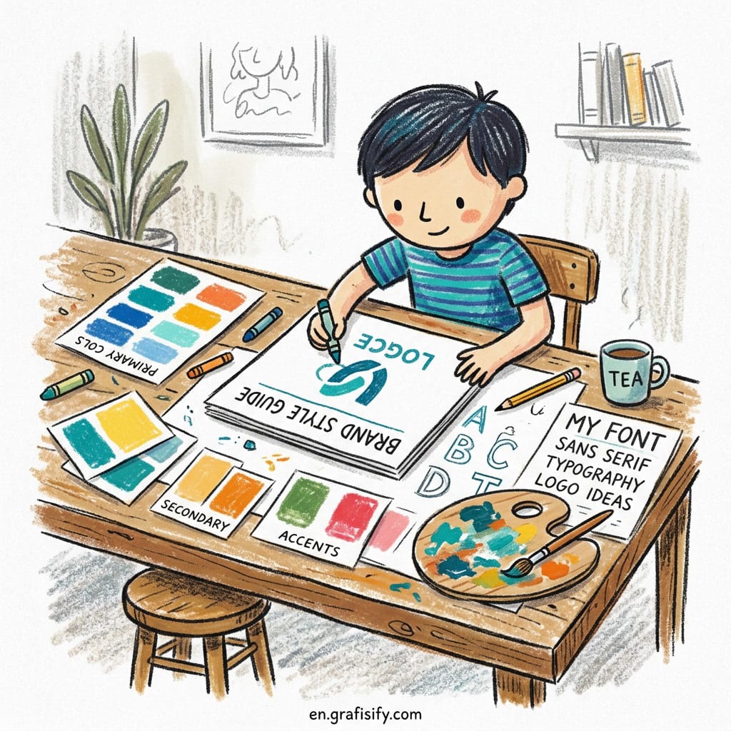
A brand style guide is a documented set of rules that define how your brand looks and communicates across every platform. Think of it as your brand’s operating manual. It covers your logo variations, color palette with hex codes, typography choices, imagery style, brand voice, and even platform-specific templates. For content creators specifically, it is the bridge between inconsistent posting and a recognizable presence.
Figma describes a brand style guide as “a source of consistency for elements such as fonts, typography, logo, color palette, imagery, brand voice, tone, and writing style.” For creators, that definition hits the mark. But there’s a key difference. Your guide needs to support rapid content output, not just corporate brochures.
Why creators need one (not just big brands)
Here is the thing. When you are a solo creator, every decision lands on your desk. What font should I use for this carousel? Should the logo go top-left or bottom-right? Is this caption too formal? Without a style guide, you answer these questions from scratch every single time. That costs you two things: time and consistency.
A study by Lucidpress found that consistent brand presentation across all platforms can increase revenue by up to 23%. For creators, consistency builds trust. When your audience sees three posts in a row and they all feel like they came from the same person, they trust you more. They subscribe. They buy.
What separates a creator guide from corporate brand guidelines
Corporate guidelines run hundreds of pages. Yours doesn’t need to. A creator brand style guide should be lightweight, practical, and designed for fast content production. You aren’t managing a global marketing team. You are managing yourself and maybe a virtual assistant or two.

The core sections you actually need are: brand foundation (mission, audience, personality), visual identity (logo, colors, typography, imagery), brand voice (tone, word bank, dos and don’ts), and platform-specific templates (social media layouts, thumbnail rules, caption structures). That’s it. Four sections. Everything else is optional.
How to Build Your Brand Style Guide for Content Creators
Here is the exact structure this guide follows. It is battle-tested from freelance projects and personal brand builds, and this sequence works every time. Start with identity, then visuals, then voice, then templates. Do not skip the order.
Step 1: Define your brand identity first
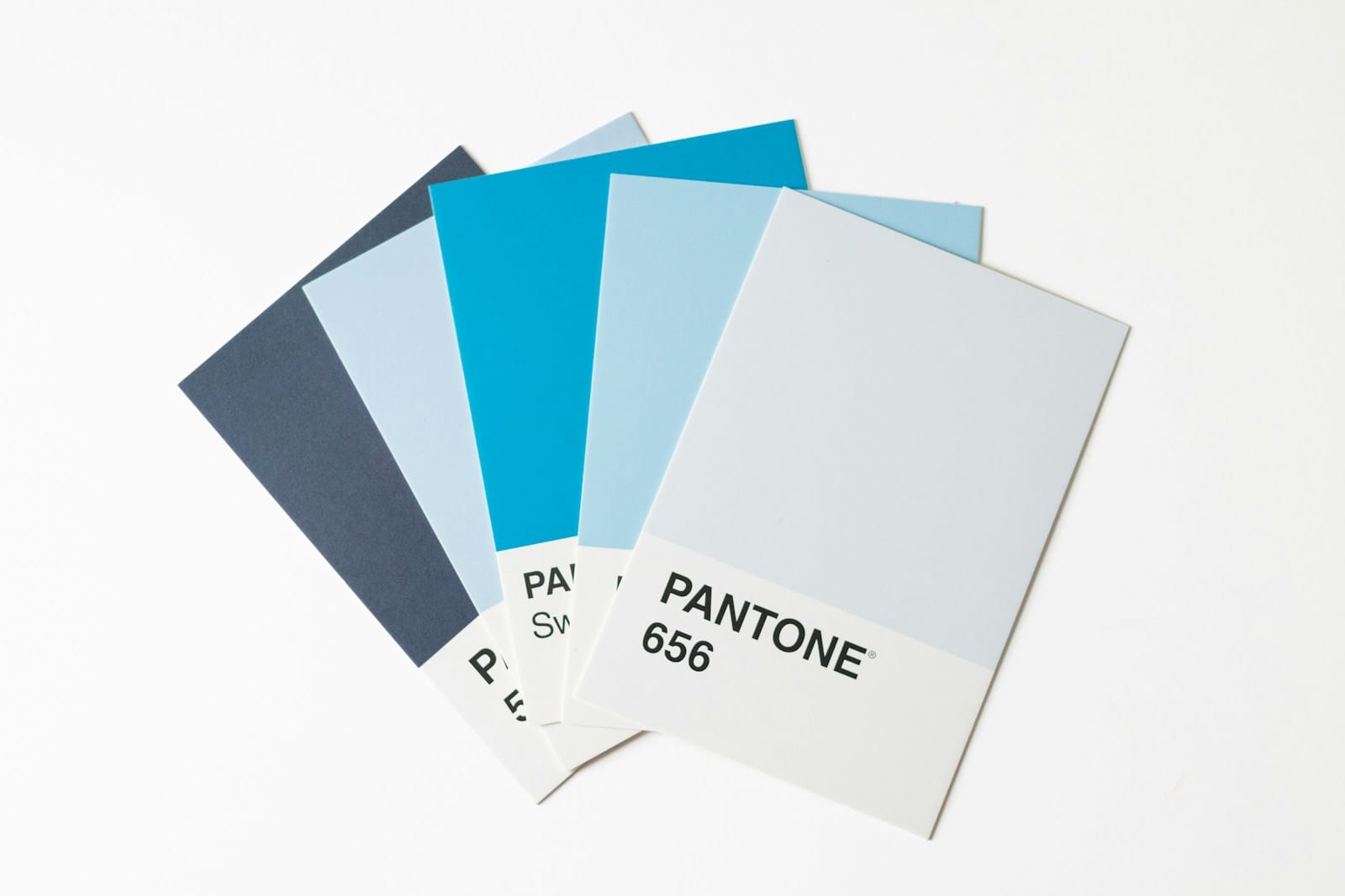
Before picking fonts or colors, write down three things: your mission in one sentence, your target audience in one paragraph, and your brand personality in three adjectives. These three inputs guide every visual decision you make later.

For example, if your brand personality is “bold, minimal, and educational,” your color palette will lean toward high-contrast combinations. Your typography will favor clean sans-serifs. Your voice will use direct language with clear explanations. The identity drives the visuals, not the other way around.
Step 2: Choose your color palette with hex codes
Most creators pick colors by feel. That works until you try to recreate the exact same shade on a different platform and end up with something that looks slightly orange instead of coral. Document everything in hex codes.
Your palette needs four layers:
Yes, only four.
- Primary color: your main brand color. The one people associate with you. Use it for buttons, key headings, and dominant elements.
- Secondary colors: two to three supporting colors for backgrounds, accents, and secondary highlights.
- Neutrals: white, off-white, and dark gray for text and backgrounds.
- Functional colors: one success color and one warning color if you use data visualization or UI elements.
A quick test. Open your last five posts on Instagram. Do they share at least one color across all of them? If the answer is no, your palette needs more structure. Document every hex code and add a short note on where each color should be used.
Step 3: Set your typography system
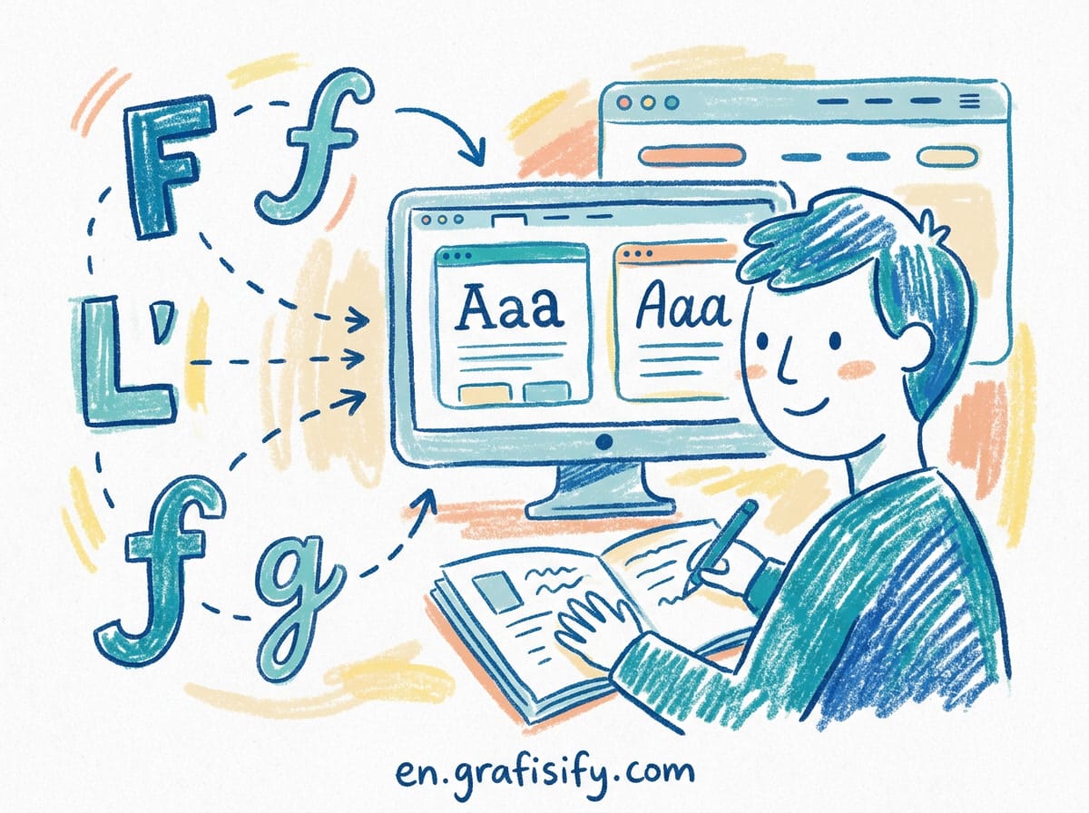
Typography is where most creator brands fall apart. The reason is simple. Without rules, you end up choosing a font for every new project, and the result is five different typefaces across your content. Pick one headline font and one body font. That’s enough.
Define a size hierarchy so you stop guessing:
| Element | Size | Weight |
|---|---|---|
| H1 / Main headline | 40-48px | Bold |
| H2 / Section title | 28-32px | Semi-bold |
| Body text | 16-18px | Regular |
| Caption / small text | 13-14px | Medium |
| CTA / button text | 16-18px | Bold |
Specify a line height (1.5 for body text is a good default) and decide whether you use all-caps anywhere. Document your fallback fonts too, because your beautiful Google Font may not render the same way on every platform.
Step 4: Create logo usage rules
Your logo is the most visible part of your brand, so it needs the most protection. Most creators have one logo file and use it everywhere, stretched, squished, or placed on a background that makes it invisible.
Create at least three logo variations:
- Full horizontal logo: for headers, website hero sections, and YouTube banner
- Icon or mark only: for profile pictures, favicons, and small spaces
- Monochrome version: for dark backgrounds and watermarks
Document the minimum size for each variation. For Instagram posts, don’t use the logo smaller than 200px wide. Define clear space around the logo equal to the width of one character in your font. Show examples of correct and incorrect placements. Do and do not. That clarity saves hours of editing later.
Brand Voice and Tone: The Missing Piece
Visual consistency gets all the attention, but voice is what makes your brand feel like a person instead of a template. You can have perfect colors and fonts, but if your captions sound robotic, your audience will not connect.
Voice pillars and tone spectrum
Define three to five voice pillars that describe how you sound. Examples: educational, warm, direct, witty, or inspiring. Then create a tone spectrum that shows how your voice shifts by platform.
Your Instagram voice might be more personal and behind-the-scenes. Your LinkedIn voice should lean professional and value-driven. Your YouTube voice can be warmer and more conversational. The personality stays the same, but the tone adjusts to the context.
Word bank: approved vs. avoided
This is a practical trick that saves you from rewriting captions. Create two lists: ten words or phrases you always use (your signature language) and ten words or phrases you never use. For example, if your brand voice is casual and direct, you might approve “here is the thing” but avoid “it’s essential to note.”
Include format rules too. Do you use bullets or paragraphs in captions? Do you open with a question or a statement? Do you use emojis sparingly or liberally? Documenting these micro-decisions prevents the drift that happens when you are in a hurry.
Pros and Cons of Having a Brand Style Guide
| Pros | Cons |
|---|---|
| Saves decision fatigue. You don’t reinvent the layout every time you post. | Takes time to create the first version. Expect 2 to 4 hours. |
| Makes your content instantly recognizable across platforms. | Can feel restrictive if the rules are too rigid. Leave room for experimentation. |
| Lets you scale. Hire a VA or designer and hand them the guide. They can produce on-brand work immediately. | Needs updating. Your brand evolves, and the guide must evolve with it. |
| Improves audience trust. Consistent brands look more professional and reliable. | Over-engineering is real. Start with 4 sections, not 20. |
The honest answer? The pros outweigh the cons for every creator who posts more than twice a week. The time you invest in building the guide pays back within the first month of consistent use.
Frequently Asked Questions: Brand Style Guide for Content Creators
Do I need a logo to start a brand style guide?
No. You can start with just colors, fonts, and voice rules. Many creators build their visual identity first and add a logo later. The style guide is about consistency, not perfection.
How often should I update my style guide?
Review it every six to twelve months. Your audience evolves, your content mix shifts, and what felt right a year ago may no longer fit. Archive the old version and publish a new one, don’t layer updates on outdated rules.
Can I use AI to help create my brand style guide?
Yes, but only after you define the core inputs. AI tools can help organize your color palette, suggest font pairings, and generate voice guidelines, but the mission, audience, and personality should come from your own decisions. AI generates options. You curate them.

Final Thoughts: Is a Brand Style Guide Worth It?
Here is the real question. Do you want to spend five minutes deciding what font goes on every thumbnail for the rest of your career, or do you want to spend four hours building a system that answers that question forever?
A brand style guide for content creators isn’t a luxury. It’s a productivity tool. It removes the micro-decisions that drain your energy and gives you back time for what actually matters: creating content your audience loves. Start with the four sections outlined above. Identity, visuals, voice, and templates. That’s all you need to go from inconsistent to unmistakable.
If you want to go deeper, check out grafisify.com for more design resources. For real-world examples, Hootsuite’s social media style guide and Figma’s guide to brand style guides are excellent references to study while building your own.

Irfan is a Creative Tech Strategist and the founder of Grafisify. He spends his days testing the latest AI design tools and breaking down complex tech into actionable guides for creators. When he’s not writing, he’s experimenting with generative art or optimizing digital workflows.




 Artificial Intelligent
 Design & Creative
 Freelance
 Gadgets & Gear
 Insights
 Laptop
 Reviews
 Smartphone
 Tech Guides
 Vibe Coding