Design Portfolio Case Studies, How to Write Them and Win Clients
Design Portfolio Case Studies, How to Write Them and Win Clients
Your design portfolio is only as strong as the stories behind the screens. Design portfolio case studies that walk a client through a real problem, show how you solved it, and prove the outcome are what turn visitors into paying customers. This guide breaks down exactly how to write them.
Here is a truth most designers don’t want to hear. Your portfolio screenshots aren’t doing the heavy lifting. Clients today have seen thousands of beautifully polished mockups. What they’re really looking for is proof that you can think, handle constraints, and deliver without drama. I have seen too many talented designers lose good projects because their portfolio told no story.
Design portfolio case studies are where that proof lives. They’re the difference between someone glancing at your work and someone reaching out to hire you. I have reviewed hundreds of design portfolios over the years, and the ones that consistently land projects share one thing. They tell a clear story about what happened and why it mattered.
Design Portfolio Case Studies: What Makes Them Effective?
An effective case study answers three questions the client is silently asking. Can you solve my specific type of problem? How do you actually work? Will working with you be a headache?
Also Read:
Most portfolios answer none of these. They show a logo redesign with no mention of the brief. They display a website mockup without saying whether it increased conversions. They leave the client to connect dots that were never put on the page.
The shift is simple. Instead of showing what you made, show what changed because you made it.
A case study isn’t a gallery with captions. It’s a narrative that proves your thinking, your process, and your ability to deliver.

Research backs this up. Portfolios with structured case studies convert at significantly higher rates than those with visuals alone, according to Nielsen Norman Group research on portfolio evaluation. Clients aren’t just buying a design. They buy confidence that the project will go well. Design portfolio case studies are the fastest way to build that confidence.
Design Portfolio Case Studies: The Four-Part Framework
Every strong case study follows the same architecture. Problem. Constraints. Process. Outcome. You can adjust the length, the visuals, and the tone, but you can’t skip any of these four parts without weakening the whole thing. Here is how each part works.
The Problem
Start with the situation before you arrived. What was broken, stuck, or not good enough? State it plainly. Avoid dramatic language. The goal is to let the reader match their own situation against yours. When a potential client sees their own problem in your case study, they have already half-decided to contact you.
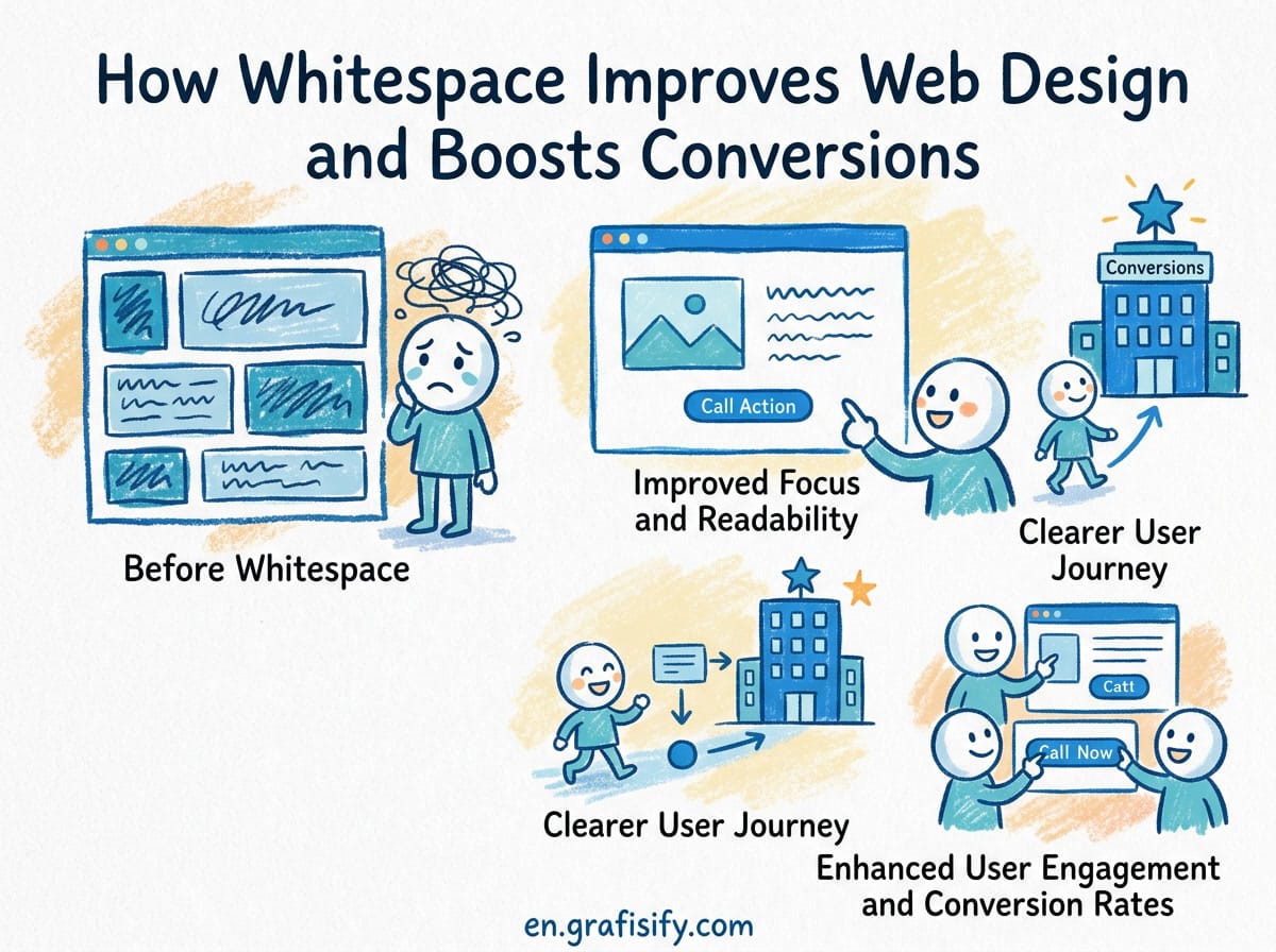
One paragraph is enough. Who was the client, what was the challenge, and why did it matter to them? If you can’t describe the problem in three sentences, you probably don’t understand it well enough yet. That clarity matters more than any visual in your portfolio.
The Constraints
This is where most designers skip the most powerful part of the story. Real work happens under real limits. Tight deadlines. Small budgets. Legacy systems. Stakeholders who changed direction three times. Mentioning constraints makes your work more credible.
A redesign delivered in two weeks with no research budget is a more impressive story than one that took three months with a full team. Constraints explain why you made the choices you did. They prove you can operate in the real world, not just in a perfect Figma file. Good design portfolio case studies always include what made the project hard.

The Process
Show the middle of the work, not just the ends. Clients don’t just want to see that you finished. They want to know how you got there. What options did you explore? What did you try that did not work? What tradeoffs did you make and why?
This section can include sketches, wireframes, early concepts, or usability findings. The goal isn’t to dump every artifact you produced. It’s to show causality. Each item should answer one question: why did the design move in this direction instead of another one?
The Outcome
Lead with the result. If you increased signups by 34%, put that number in the first sentence of the case study, not buried on page three. If you don’t have hard metrics, use qualitative evidence. User feedback. A client testimonial. A clear before-and-after description.
Numbers are best, but honesty beats silence. “The client renewed twice and referred two more” is proof of trust. “Cut the invoice turnaround from three weeks to four days” is specific and modest and beats vague and grand every time. If you’re writing design portfolio case studies, the outcome is the part that closes the deal.
| Case Study Element | What to Include | What to Skip |
|---|---|---|
| Problem | The specific challenge in one clear paragraph | Industry jargon or dramatic framing |
| Constraints | Deadlines, budget limits, technical restrictions | Excuses or blame |
| Process | Key decisions and why you made them | Every minor iteration or irrelevant artifact |
| Outcome | Quantified result or clear qualitative evidence | Vague adjectives like “great success” |
Common Mistakes That Kill Portfolio Conversions
The most damaging mistake is including too many projects. A portfolio with thirty thumbnails and no context forces the client to figure out whether you’re any good. Most won’t bother. They will close the tab and move on.
Three to five strong, detailed case studies will outperform twenty shallow thumbnails every single time. Depth wins. Pick your best projects, the ones with the clearest results and the most interesting process, and go deep on those. Rotate the weakest one out whenever you ship something better. Think of each as a mini portfolio that could stand alone.
Writing for designers instead of clients. Technical jargon impresses your peers. It doesn’t impress the marketing director who needs their landing page redesigned by next month. Write for the person paying the bill. Use plain language. Skip the philosophy lecture.
Hiding the contact information. If someone has to hunt for a way to reach you, you have already lost them. One clear call to action on every page works best. A contact form, a booking link, or a direct email address. Tell them what happens next after they reach out.
Ignoring mobile. A significant portion of your potential clients will view your portfolio on a phone. If your case study images are tiny or your text is unreadable on a small screen, that visitor is gone. Test every page on mobile before you publish.
Skipping SEO. Your portfolio images need descriptive alt text. Your meta titles should say what you do, not just your name. “Jane Smith, Freelance UI/UX Designer in Portland” is infinitely more useful to search engines than “Home – Jane Smith.” These small changes compound over time. Learn more about SEO for design portfolios to get the full picture.
How to Write Case Studies Without Hard Metrics
Not every project comes with a clean number at the end. That’s normal, especially for brand identity, print work, or early-stage projects. A missing metric isn’t a missing case study. You just need to shift what you lead with.
Use qualitative evidence instead. What did the client say about the work? Did they renew? Did they refer someone else? Did the project come together under a tight deadline that seemed impossible? Specific and modest beats vague and grand every time.
You can also describe the constraint you solved. “The client had no brand guidelines and a three-week launch deadline. We designed a full visual system in that window, and the product launched on time.” No percentage there, but the reader understands exactly what you handled.
Another approach is to build spec work or personal projects with real documentation. Pick a brand you admire and redesign something it actually needs. Write it up like a real engagement. The goal isn’t to fake experience. It’s to demonstrate how you think, which is what the reader is actually buying. For a deeper look, check out this guide on building a freelance design portfolio. The A List Apart community has a great breakdown of how to structure these narratives for maximum clarity.
Here is a quick test. If you removed the visuals from your case study, would the text still convince someone to hire you? If the answer is no, you’re leaning too hard on the screenshots. The story should stand on its own. The images are supporting evidence, not the main argument. This is the hardest lesson in writing design portfolio case studies, but also the most important one.
Final Thoughts
A case study that wins clients doesn’t need to be long. Three to five paragraphs covering problem, constraints, process, and outcome is the right length. One or two strong visuals to support each section. A clear call to action at the end.
The designers who land the best projects aren’t always the most talented ones. They’re the ones who communicate their talent most clearly. Your case study is how you prove you can think, not just push pixels. Write it like the person reading it’s about to make a decision. Because they’re.
Start with your three strongest projects. Write up each one using the framework above. Lead with the outcome. Show the process. Be honest about the constraints. Make it easy to contact you. Update it every time you finish something better. That’s all it takes.

Irfan is a Creative Tech Strategist and the founder of Grafisify. He spends his days testing the latest AI design tools and breaking down complex tech into actionable guides for creators. When he’s not writing, he’s experimenting with generative art or optimizing digital workflows.


 Artificial Intelligent
 Design & Creative
 Freelance
 Gadgets & Gear
 Insights
 Laptop
 Reviews
 Smartphone
 Tech Guides
 Vibe Coding