Design Tokens: A Practical Guide to Building a Token System
Why design tokens matter
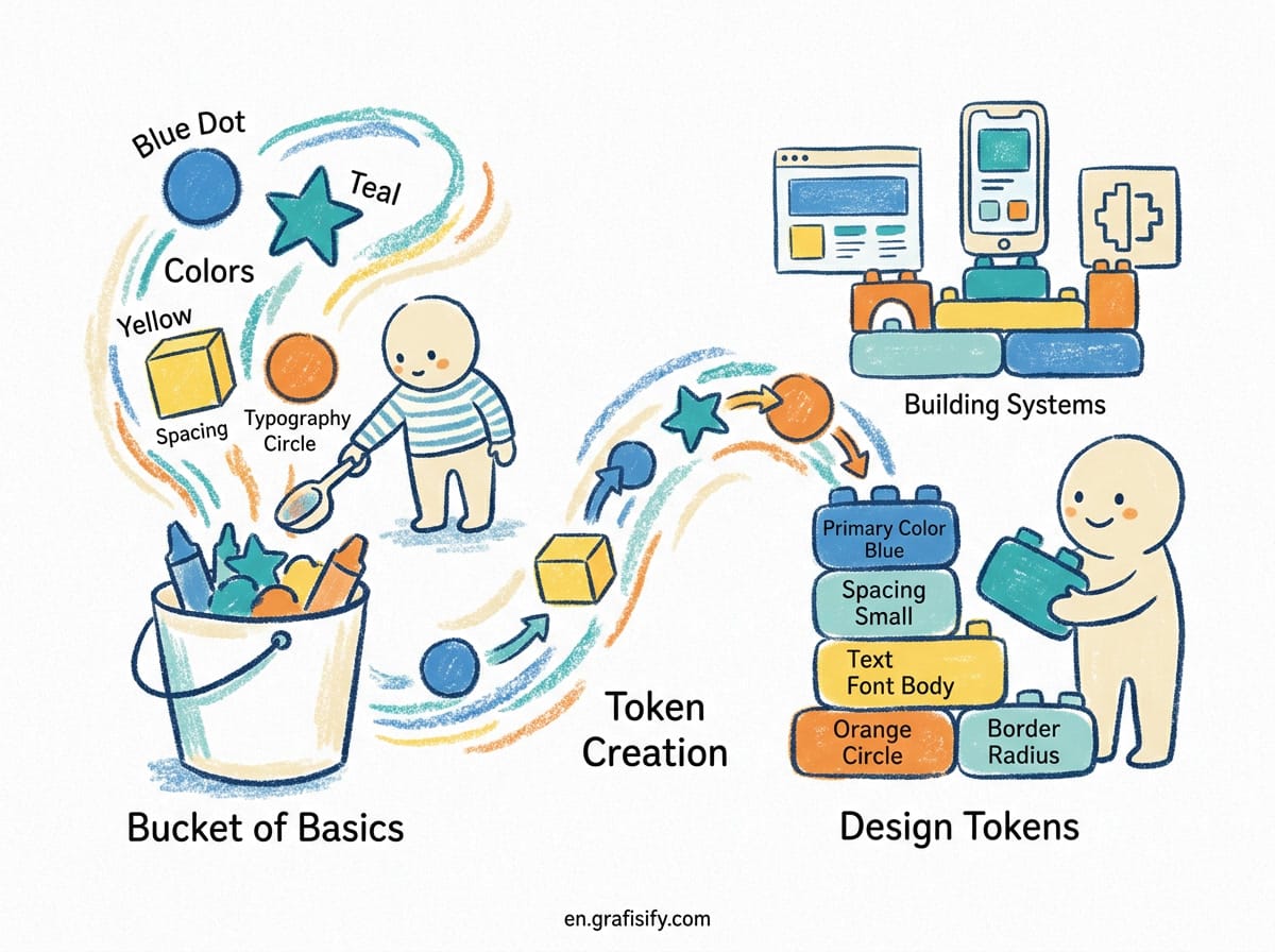
Design tokens are the single source of truth for the visual properties in a product. A token is a named value, such as a color, spacing unit, font size, or border radius. Instead of hardcoding #1a73e8 or 16px in a dozen places, you define a name like color-action-primary, and every part of the product references that name.
The idea comes from Salesforce, which needed a way to share the same visual language across web, mobile, and email. The concept stuck. A 2025 survey by Zeroheight found that 84 percent of product teams now use design tokens in some form, up from 56 percent a year earlier.
That jump did not happen by accident. Tokens let a team change a brand color or a spacing scale in one place and see it update across Figma, iOS, Android, and the web. Without them, that kind of change means hunting through files, old designs, and codebases. Designers update one screen, and weeks later someone finds a screen that was missed because it used a raw hex value buried in a component.
The shift matters even more now that AI tools generate UI from prompts. A model can only stay on brand if it has a clear set of tokens to work from. When your design system is expressed as tokens, an AI builder can reference the same primitive and semantic values a human designer would. That keeps generated output consistent with everything else in the product.
Also Read:
For a small team or a solo designer, tokens seem like overhead. The honest truth is that a project with a handful of screens can get by with hardcoded values. The pain appears when the product grows, when a rebrand arrives, or when dark mode becomes a requirement. By then, retrofitting tokens is far more expensive than starting with them.
What is a design token, exactly
A token has two parts: a name and a value. The name should describe what the token is for, not how it looks. color-brand-primary is a good name. color-blue-500 is a weaker one, because it ties the token to a specific hue that may change.
Tokens can hold any reusable design decision. The most common categories are color, spacing, typography, radius, and shadow. But teams also use them for motion, z-index, breakpoints, and opacity. A motion token might store a duration and an easing curve, so every animation in the product moves at the same feel. A breakpoint token keeps responsive behavior consistent across designers and developers.

Here is a simple example of a color token written in the W3C Design Tokens format:
{
  "color": {
    "brand": {
      "primary": { "value": "#1a73e8" }
    }
  }
}
That nested structure reads clearly. color.brand.primary is a color, in the brand group, used as the primary value. Naming is not decoration. It is the way a token communicates its intent to whoever reads it months later, including an AI tool that has no idea what the product should look like.
The W3C Design Tokens Community Group published its first stable specification, version 2025.10, in October 2025. It is backed by more than 24 organizations, including Adobe, Amazon, Google, Meta, Figma, and Microsoft. That shared format means a token file written today is more likely to work across tools tomorrow, without heavy conversion.
Primitive, semantic, and component tiers
Most mature token systems use three tiers. The tiers keep raw values separate from meaning, which is what makes the system easy to change later.
Primitive tokens hold raw values. blue-500, space-16, and radius-md all live at this layer. They have no context. They just store a base value that other tokens point to.
Semantic tokens assign purpose. color-action-primary, color-surface-raised, and spacing-card-padding say what a value is used for. Multiple semantic tokens can point at the same primitive, and that is fine. A blue-500 might back both a primary action color and a link color in two different contexts.

Component tokens scope a value to one part of the UI. button-bg-hover describes only the hover state of a button. Dependencies flow one way: primitives feed semantics, and semantics feed components. This keeps the graph manageable and makes it easy to trace where a change will land.
Seen in practice, a button background might work like this:
blue-500             (primitive: #1a73e8)
color-action-primary  (semantic: points to blue-500)
button-bg-default     (component: points to color-action-primary)
button-bg-hover       (component: points to color-action-primary-hover)
Why go through all those layers? Because a rebrand or a dark mode flips only the primitive layer. The semantic and component layers never change, so nothing downstream breaks. A design system that skips the tiers and lets components read primitives directly has all the naming without the flexibility.
How to build your first token set in Figma
Figma has native support for variables, which map cleanly onto design tokens. You do not need a plugin to start, though plugins like Tokens Studio make syncing to code easier.
Start with color. List every color your product actually uses, then group them into primitives and semantics. Give each one a clear name. When you create the variables, keep the naming consistent with your codebase so designers and developers speak the same language.
Next, add your spacing scale. A common approach is a base unit multiplied by a scale, such as 4, 8, 12, 16, 24, 32. Define each as a space-* token rather than typing pixel values into every frame. A 4-point base keeps the scale small and predictable, and it snap-padds nicely inside Figma’s layout grids.
Then do typography. Set your font family, sizes, and line heights as tokens. This is where a clean system pays off fastest, because type is repeated everywhere. Define a small set of type tokens, such as type-heading-lg, type-body-md, and type-caption-sm, and reference them across all screens.
Finally, add radius and shadow. These are small but easy to get inconsistent. A small set of named tokens keeps corners and elevation uniform across the product.
Here is a comparison of the two approaches when a product needs a new color:
| Approach | New brand color effort | Risk of missed spots | Dark mode readiness |
|---|---|---|---|
| Hardcoded values | Find and edit every instance | High | Rebuild by hand |
| Primitive tokens only | Edit base color once | Medium | Partial |
| Three-tier tokens | Edit primitive layer only | Low | Flip semantic layer |
A practical first system does not need hundreds of tokens. Keep to the essentials: 6 to 10 colors, 6 spacing values, 4 to 6 type sizes, 3 radius values, and 2 shadow levels. That is enough to be consistent without being overwhelming.
From Figma to CSS with Style Dictionary
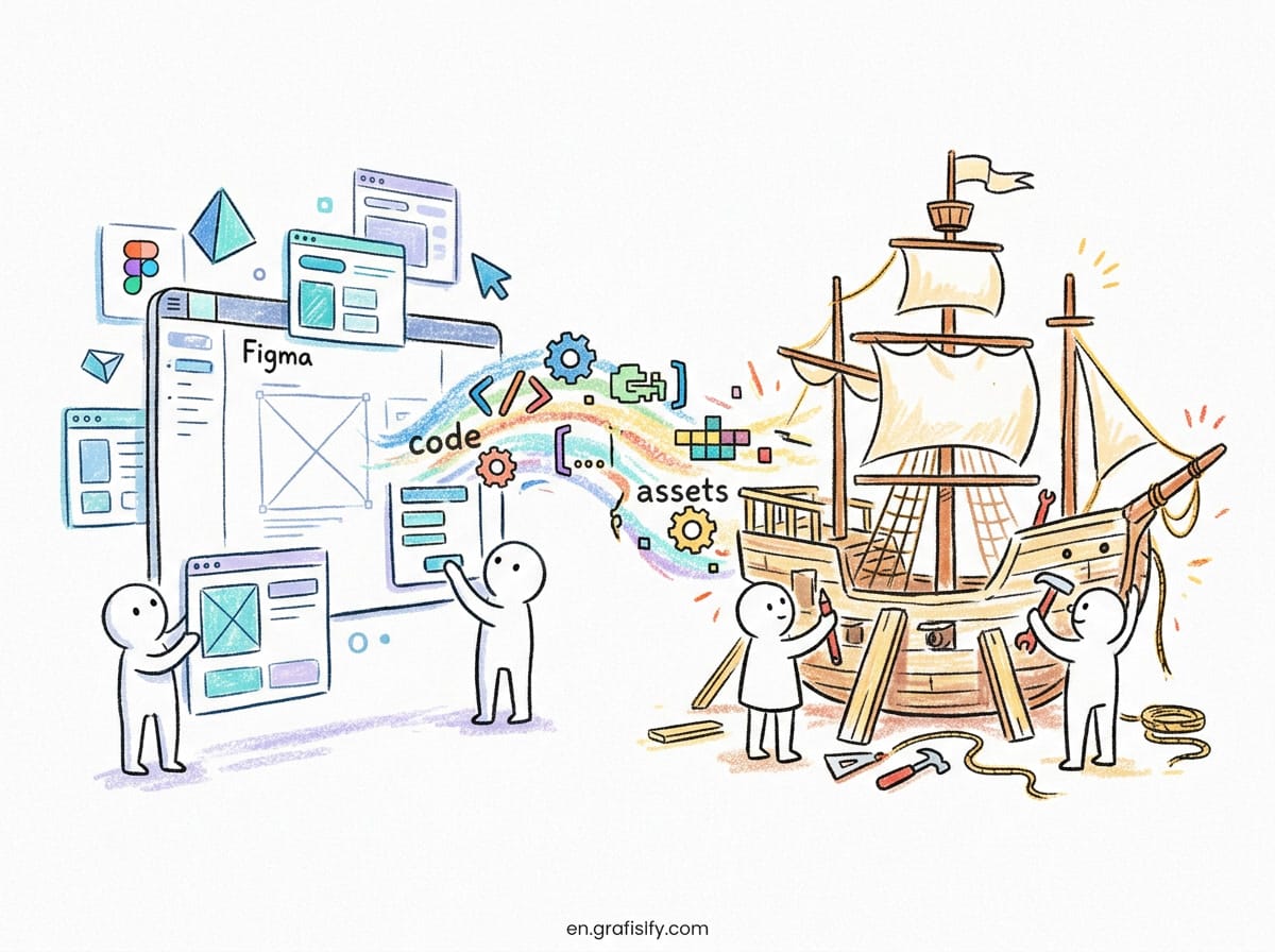
Design tokens only half solve the problem. The other half is getting the same values into code, across multiple platforms, without manual copying. This is where a build tool like Style Dictionary comes in.
Style Dictionary, created at Amazon, reads a single token file and exports it to many formats: CSS variables, Sass, JavaScript, iOS, and Android. You define tokens once and the tool produces the platform-specific output.
The workflow is straightforward. Designers maintain the token source, often synced from Figma. Developers run the build tool, and it generates the platform files they import. Because the output is generated, the values in code can never silently drift from the values in design.
With the 2025.10 release of the W3C Design Tokens spec, tooling is converging on one format. That means your token file can move between Figma, Style Dictionary, Tailwind, and native app frameworks with less friction.
To get started, write your tokens as JSON, point Style Dictionary at the file, and let it generate a variables.css output. Your frontend team then imports that file and uses the CSS custom properties directly. For dark mode, you generate a second set of CSS variables for the dark semantic values and swap them with a theme class or a media query.
Common mistakes and how to avoid them
The most common mistake is token bloat. Teams create hundreds of tokens that nobody uses. Every primitive color should have a semantic wrapper only when it is actually consumed, and components should reference semantics, never primitives directly.
Another mistake is breaking the one-way dependency. If a component reads a primitive value instead of a semantic token, a future rebrand silently misses that component. The fix is a naming convention and a code review habit that catches direct primitive references.
A third problem is keeping tokens in sync between design and code. If designers update a Figma variable but the codebase still has the old value, the two drift apart. The solution is an automated pipeline that turns the design token source into committed code, not a manual copy step.
Last, avoid over-engineering the first time. A small, complete token set beats a large, half-adopted one. You can always add tiers and tokens as the product grows. Start with the values you use today, and let the system grow with real needs rather than guesswork.
Key takeaways
Design tokens give a product one source of truth for visual properties. They keep designers and developers consistent, and they make rebrands and theme changes much cheaper.
The practical path is clear. Start small with colors, spacing, and type. Use three tiers so meaning stays separate from raw values. Keep design and code in sync with a build tool. Skip the bloat.
Whether you are a solo designer or part of a large team, a small token system beats a wall of hardcoded values every time. When the rebrand comes, or when dark mode becomes a requirement, you will be glad the raw values live in one place instead of scattered across every file.

Irfan is a Creative Tech Strategist and the founder of Grafisify. He spends his days testing the latest AI design tools and breaking down complex tech into actionable guides for creators. When he’s not writing, he’s experimenting with generative art or optimizing digital workflows.


 Artificial Intelligent
 Design & Creative
 Freelance
 Gadgets & Gear
 Insights
 Laptop
 Reviews
 Smartphone
 Tech Guides
 Vibe Coding