10 Design Trends Creatives Are Exhausted By in 2026

10 Design Trends Creatives Are Exhausted By in 2026
Every few years, the design world collectively decides it’s done with something. It happened to skeuomorphism. It happened to beveled everything. It happened to gradients the first time around.
But 2026 feels different. The backlash isn’t just about one aesthetic overstaying its welcome; it’s a full-blown reckoning with how design gets made, who gets credit, and what we’re actually trying to say. The Creative Boom community survey from April 2026 rang the alarm: ten major design trends creatives are tired of have officially worn out their welcome, and creatives are speaking up louder than ever.
The thread running through all of them? It’s not that the aesthetics are bad. It’s that they’ve become shortcuts; substitutes for intention, craft, and original thinking. Here’s what designers, illustrators, and art directors are exhausted by, and what’s rising to take its place.
1. AI Slop; The Unwanted Guest That Won’t Leave
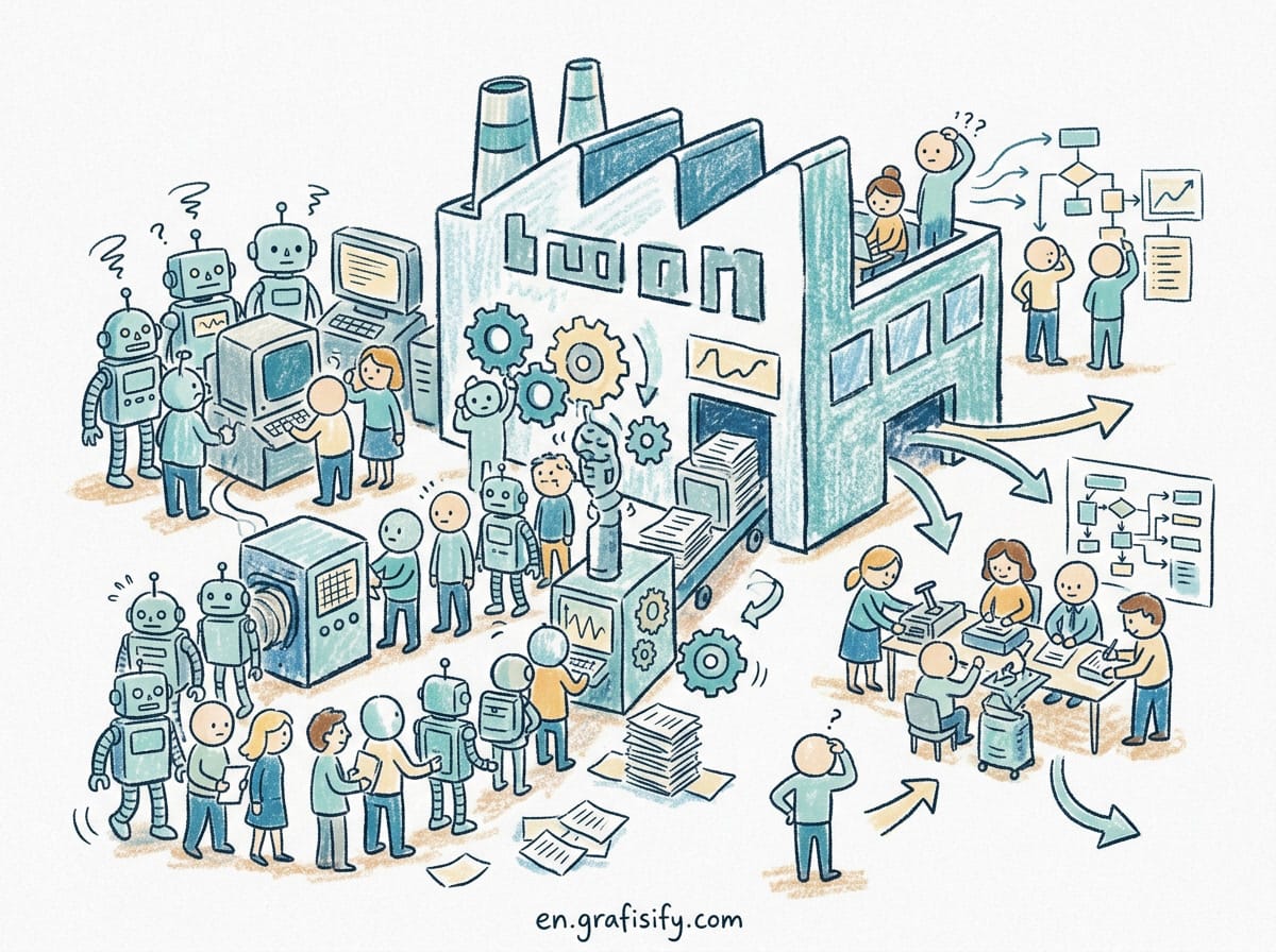
If there’s one trend that unites every creative in shared exhaustion, it’s AI-generated content that nobody asked for. The term “AI slop”; low-effort, uncanny, obviously-generated imagery flooding feeds; has become the defining complaint of 2026.
And it’s not just designers complaining. The numbers are brutal. According to Sprout Social’s Q1 2026 Pulse Survey, 83% of social media users say they encounter AI slop at least “sometimes.” More damning: 50% of Gen Z have actively unfollowed a brand specifically because of low-effort AI content. That’s half of your target audience walking away because they can tell you stopped trying.
The problem isn’t AI as a tool; plenty of designers are using generative tools intelligently as part of their workflow. The problem is content made purely to fill space: the generic “business person shaking hands” image, the waxy-faced portrait, the blog hero with six-fingered hands and text that looks like letters but dissolves into gibberish when you look closely. It signals one thing: we didn’t care enough to hire someone.
2. AI Caricatures; The Uncanny Valley Got a Sequel
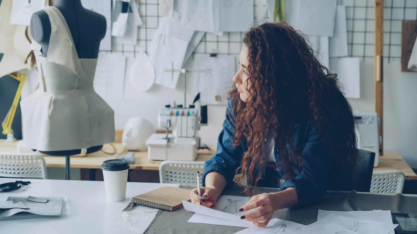
A more specific cousin of AI slop, AI caricatures; the smoothed-over, weirdly-lit approximations of human faces; earned their own spot on the exhaustion list. Think of the profile photos on “about our team” pages that look vaguely human but somehow off. The mouths that don’t fully close. The teeth that merge into gums. The backgrounds that dissolve behind people’s hair like bad Photoshop from 2008.
Adobe’s 2026 Creative Trends Forecast confirms a sharp pivot away from synthetic-looking imagery. The report flags a growing consumer preference for organic, human-centered design; exactly the opposite of what AI caricatures deliver. When your brand uses these images, you’re not saving money; you’re telling customers you cut corners on the first thing they see.
3. Glassmorphism; Once Cool, Now Everywhere
Let’s be fair to glassmorphism: when Apple introduced it with the Liquid Glass aesthetic in visionOS in 2025, it was genuinely stunning. Frosted glass panels, layered depth, subtle backdrop blur; it felt like the future.
Then everyone copied it. Within months, every SaaS dashboard, every portfolio site, every mobile app concept on Dribbble was using the exact same frosted glass overlay with the exact same pastel gradient behind it. What started as a signature look for spatial computing became the design equivalent of a default WordPress theme.
The backlash isn’t against the aesthetic itself. It’s against the lack of imagination in applying it. When every startup’s landing page uses the same glass card with the same 20px backdrop blur, you’re not expressing a brand identity. You’re following a template.
4. Gradients; The Return of the Overdone
Gradients are the phoenix of design trends: they burn out, go away for a few years, then rise again, slightly different. The 2026 version is bolder and more saturated than the soft duotones of the 2010s, but the fatigue is real.
The issue mirrors glassmorphism: every app icon, every presentation background, every social media template uses the same hot pink-to-purple-to-blue sweep. It’s become visual wallpaper; the design equivalent of elevator music. When 68% of presentation designers now report flat/minimalist backlash (DesignPulse Survey, March 2026), it’s partly because the “solution” was just another flavor of the same problem: style substituting for substance.
5. Lazy Minimalism; Less Isn’t Always More
For a decade, minimalism was the safe choice. Clean lines, lots of white space, sans-serif everything. It felt modern, trustworthy, and restrained. But somewhere around 2024, minimalism stopped being a design philosophy and became a default; the path of least resistance for designers who didn’t want to make a decision.
Lazy minimalism is the version where you strip away everything until there’s nothing left to critique, but also nothing left to say. A white page with a thin sans-serif headline and a single button isn’t “clean.” It’s empty. And audiences are starting to notice the difference between purposeful restraint and aesthetic bankruptcy.
What’s replacing it? A counter-movement toward warmth, personality, and what some designers call “generous maximalism”; layouts with texture, character, and visual interest that actually rewards attention. Think editorial spreads, layered typography, and compositions that feel alive rather than sterile.
6. Lazy Maximalism; The Opposite Problem, Same Result
Just as lazy minimalism strips away everything, lazy maximalism throws everything in. Chaotic collages of unrelated elements, dense type stacks, clashing colors with no intentionality behind them. It’s the design equivalent of shouting; loud, attention-grabbing, but ultimately empty.
The best maximalist work; think of David Carson in the 90s, or contemporary artists like Stefanie Posavec; uses density with purpose. Every element earns its place. Lazy maximalism, by contrast, uses busyness as a substitute for meaning. It’s the style equivalent of a teenager saying “it’s art, you wouldn’t get it.”
7. Template Culture and the Canva-ification of Design
There’s nothing wrong with Canva. It democratized design, gave small businesses access to visuals they couldn’t afford otherwise, and launched a thousand creator careers. But the backlash against template culture is about what happens when the middleman between a brand and its audience is a template library.
When every Instagram carousel uses the same free presentation template, every brochure follows the same Canva layout, and every brand pitch looks like it came from the same “Modern Business” pack, you lose the one thing design is supposed to provide: differentiation. Brands that look identical to their competitors haven’t designed their identity. They’ve outsourced it to a template.
The growing hunger is for bespoke, original visual systems. Custom illustration. Hand-drawn elements. Typography that isn’t one of the ten most-used Google Fonts. The pendulum is swinging back toward craft.
8. Y2K Nostalgia; It’s Time to Let Go
The endless Y2K nostalgia cycle has run its course. What started as a fun, ironic callback to the fashion and design of 1999-2003 has become a creative crutch. Metallics, chunky typography, butterfly motifs, and low-resolution textures that were once refreshing throwbacks now feel like a design trend that refused to age gracefully.
The fatigue comes from the same place as template culture: when every album cover, every fashion brand’s social campaign, and every “Gen Z targeted” ad uses the same Y2K visual language, it stops being a reference and starts being a uniform. The most interesting designers in 2026 are looking forward, not backward; building visual languages that feel genuinely new rather than recycled from two decades ago.
9. Bento Grids; A Layout That Became a Shortcut
Apple popularized the bento grid; the asymmetric, tile-based layout that looked like a Japanese bento box; and within months it was everywhere. Product pages, feature comparisons, pricing tables, about sections; any multi-item content got the bento treatment.
The problem isn’t the layout itself; bento grids can be visually interesting when used thoughtfully. The problem is that it became the default way to organize any set of items. When a design choice becomes reflex rather than decision, it ceases to be design at all. The grid should follow the content, not the other way around.
10. Motion for Motion’s Sake
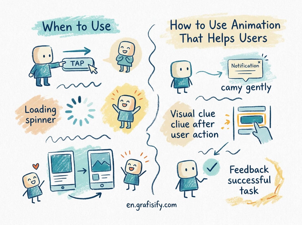
Web design in 2026 is more animated than ever, and that’s not necessarily a good thing. Motion for motion’s sake; elements that slide in, fade up, or bounce simply because they can; has earned a slot on the exhaustion list. Micro-interactions that add delight are one thing. A page where you wait three seconds for every section to animate into view before you can read it is another.
Good motion design serves a purpose: it guides attention, communicates hierarchy, provides feedback, or tells a story. Bad motion design is decoration that gets in the way. The best product designers in 2026 are pulling back; reserving animation for moments where it genuinely improves understanding, not just aesthetics.
What’s Rising: The Counter-Movements
Every exodus has a destination. Here’s what’s gaining momentum as these design trends creatives are tired of fade:
Collage and analog imperfection. Hand-cut paper textures, scanned elements, photocopier artifacts. The rougher the better; audiences are craving evidence of human hands.
Surreal and absurdist imagery. Not the uncanny valley of AI, but deliberately strange, dreamlike compositions that feel authored. Think Magritte meets editorial design.
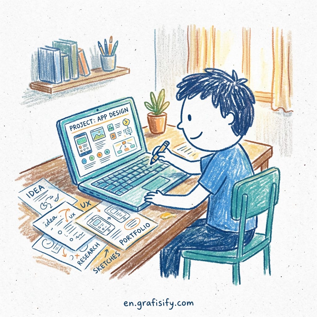
Organic imperfection. Wonky hand-drawn lines, irregular spacing, typography that doesn’t sit on a strict baseline grid. The look of “I made this” rather than “Figma generated this.”
Warm personal visual systems. Brands are moving away from sterile corporate aesthetics toward illustrations, color palettes, and typography that feel personal, even quirky. The brands winning in 2026 are the ones that look like they were made by people, not agencies.
The lesson across all ten trends is the same: intention is the only differentiator that matters. An overused trend applied with purpose still works. A fresh technique applied thoughtlessly falls flat. The designers who thrive in 2026 won’t be the ones with access to the newest tools. They’ll be the ones who know what they want to say before they start making.
FAQ
What design trends are creatives tired of seeing in 2026?
According to Creative Boom’s 2026 community survey, the top ten include AI slop, AI caricatures, glassmorphism, gradients, lazy minimalism, lazy maximalism, Canva/template culture, Y2K nostalgia, bento grids, and purposeless motion design. You can explore more design insights on grafisify.com.
Why is everyone so over AI slop right now?
83% of social media users encounter AI slop regularly, and 50% of Gen Z have unfollowed brands for using low-effort AI content (Sprout Social Q1 2026). The backlash is driven by audiences who can tell when brands prioritize cost-cutting over craft.
Is minimalism finally dying in graphic design?
“Lazy minimalism”; the version where you strip away everything without intent; is on the way out. But purposeful, warm minimalism with texture and personality is still thriving. The distinction is between restraint as a philosophy and restraint as a shortcut.
What’s replacing glassmorphism in 2026?
Designers are moving toward collage, analog textures, surreal/absurdist imagery, and warm personal visual systems. The common thread is a hunger for evidence of human authorship; marks, imperfections, and intentional strangeness that no template can fake.
What do consumers actually want from brands on social media in 2026?
Authenticity over polish. Originality over templates. Human-created content over AI generation. Adobe’s 2026 Creative Trends Forecast confirms a decisive pivot toward organic, human-centered design as a direct counter-reaction to the algorithmic sameness that dominates feeds.

Irfan is a Creative Tech Strategist and the founder of Grafisify. He spends his days testing the latest AI design tools and breaking down complex tech into actionable guides for creators. When he’s not writing, he’s experimenting with generative art or optimizing digital workflows.
You might also like
 Artificial Intelligent
 Design & Creative
 Freelance
 Gadgets & Gear
 Insights
 Laptop
 Reviews
 Smartphone
 Tech Guides
 Vibe Coding