Motion Design in UI/UX: When and How to Use Animation That Helps Users
Motion Design in UI/UX: When and How to Use Animation That Helps Users
Most UI animation gets added for the wrong reason. Someone opens a motion library, picks a bounce curve, and calls it polish. The result is a page that feels busy and slow, and a design that quietly alienates part of its audience.
Motion is not decoration. It is a functional layer of your interface, as real as spacing or color. Good motion tells the user where they are, what changed, and what to do next. Bad motion just eats time and creates motion sickness. This guide explains when animation genuinely helps, and the specific rules that keep it from hurting.
What Motion Actually Does in an Interface
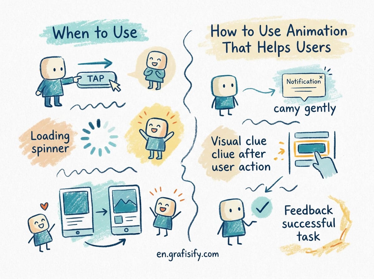
Animation earns its place when it communicates something. In interface design, motion has three real jobs: orienting the user, conveying state, and guiding attention.
Orientation means showing spatial relationships. When a menu slides out from the right edge, the user learns where that panel lives even without reading it. When a card expands to full screen, the eye traces the origin of the content. These transitions build a mental model of the interface, and that model reduces cognitive load.
Conveying state is where motion replaces words. A spinner says “working”. A button that morphs into a checkmark says “done”. A row that fades and slides before deletion confirms the action without a modal. Users read these signals faster than text, and they feel more natural than a hard jump.
Guiding attention uses movement as a pointer. A subtle pulse on an unread badge draws the eye. A floating action button that nudges when it appears invites interaction. Motion lets you direct focus without the heavy handedness of an arrow or an alert.
If an animation does none of these three things, cut it. Decorative motion, the kind that animates purely because it can, adds latency and noise for no payoff.

Duration: The Speed That Feels Instant
Speed is the first thing to get right, because it has the biggest effect on whether motion feels good or sluggish. If an animation runs too long, the interface feels slow. Too short, and it becomes a flicker the user cannot track.
UI animations sit in a narrow window. Most guidance puts element transitions between 150 and 300 milliseconds. Elements entering the screen feel right around 200 to 300 milliseconds, while elements leaving can run faster, around 150 to 200 milliseconds. Material Design defaults to roughly 240 milliseconds for standard transitions, which is a good baseline to test against.
There is a useful asymmetry here. Entrance animations can be slightly slower because the user is watching something appear and the eye needs a beat to register it. Exit animations should be quicker, because nothing is being introduced and a lingering element just holds the page hostage.
Duration also scales with distance and size. A full screen transition warrants more time than a tooltip, because the eye has further to travel. A tiny badge can animate in under a hundred milliseconds; a full page handoff needs closer to three hundred. Match the duration to the weight of the change, not to a personal preference for slow, cinematic transitions.

Easing: The Difference Between Human and Robotic
Duration controls how long motion lasts. Easing controls how it moves. Without easing, everything moves at a constant speed, which is what makes animation look mechanical. Real objects accelerate when they start moving and decelerate when they stop, because that is how physics works.
The standard pattern is ease-out for entering elements and ease-in for exiting ones. An element that enters eases out, starting fast and slowing as it settles into place, like a drawer that arrives and gently comes to rest. An element that exits eases in, decelerating as it leaves, which reads as the object being dismissed rather than flying away.
Most design systems ship a small set of named curves: standard, emphasized, and decelerate or accelerate. You do not need to build curves from scratch. You need to pick the right one for the movement and apply it consistently.
Avoid excessive bounce and spring effects on anything that carries meaning. A little overshoot on a notification can feel friendly. The same bounce on a navigation menu reads as gimmicky and makes the interface feel unstable. Save playful easing for moments where playfulness is the point, and keep structural UI calm.
The Comparison: Motion Done Well vs Motion Done Wrong
The difference between helpful and harmful motion is rarely subtle. Here is a side by side view of what each looks like in practice.
| Quality | Motion that helps | Motion that hurts |
|---|---|---|
| Duration | 150 to 300 ms, matched to element weight | 600 ms plus, feels slow and heavy |
| Purpose | Orientation, state, or attention | Decoration only, no message |
| Easing | ease-out on enter, ease-in on exit | Constant speed, robotic movement |
| Reduced motion | Honors prefers-reduced-motion | Ignores the setting entirely |
| Frequency | A few meaningful transitions | Everything animates constantly |
| Flashing | Stays under three flashes per second | Strobing, blinking, rapidly pulsing |
| Outcome | Faster perceived navigation | Higher cognitive load, slower feel |
Read down the right column and you have a checklist of what to avoid. Most of the harm from animation comes from ignoring these constraints, not from using motion at all.
Accessibility: Motion Must Not Exclude
Animation is not neutral for everyone. A meaningful share of users have vestibular disorders, and large or sudden motion can trigger dizziness, nausea, and headaches. Photosensitive users face the additional risk of seizures from flashing. Design that ignores this is design that excludes real people, whatever the aesthetic payoff.
Start with the operating system setting. Modern browsers expose the user’s OS preference through the CSS media feature prefers-reduced-motion. On macOS it lives under System Settings and then Accessibility and then Display, and the user toggles Reduce motion. When that preference is present, your site should replace animation with cross-fades or instant transitions, or drop motion altogether. This is the single highest impact accessibility fix for motion, and it is cheap to implement.
Then handle the WCAG requirements. Success Criterion 2.2.2, a Level A requirement, says any animation that runs longer than five seconds needs a way to pause, stop, or hide it. Success Criterion 2.3.1, also Level A, caps flashing at three flashes per second, which is the photosensitive seizure threshold. Success Criterion 2.3.3, Level AAA, requires that motion triggered by user interaction can be disabled entirely.
Parallax and large scale changes deserve particular caution. Movement that scales content at or above 1.5 times, or relies on translate and rotate in 3D space, is more likely to trigger symptoms. If a scroll effect sits on parallax, test it with reduced motion enabled and confirm it degrades gracefully.
Building a Motion System Instead of Ad Hoc Animations
Motion becomes predictable the same way color and typography do: through tokens. The strong teams define duration and easing once, name them, and reference them everywhere. The result is an interface where every transition feels like it belongs to the same brand, because it literally comes from the same source.
A minimal motion token set has three or four durations and three easing curves. For example, you might define fast at 120 milliseconds for toggles and badges, medium at 200 milliseconds for small elements, slow at 300 milliseconds for panels and pages, and extra slow for large full screen transitions. Easing gets one curve for entering, one for exiting, and one emphasized curve for large expressive moves.
Store these in the same place as your color and spacing variables. When a developer needs a transition, they pull a named token instead of inventing a new duration and curve. That single change removes most inconsistency across a codebase and makes the interface feel intentional.
Document the system the way you document other design decisions. Write a short motion section that explains when to use each token and when to avoid motion. Include the reduced motion rule in that document so it is part of the system rather than an afterthought.
Practical Rules to Take Into Your Next Project
These are the constraints that matter most, gathered into one list you can apply immediately.
- Only animate to orient, show state, or guide attention
- Keep element transitions between 150 and 300 milliseconds
- Use ease-out for entering elements and ease-in for exiting ones
- Scale duration to the size and distance of the change
- Honor prefers-reduced-motion and degrade to simple fades
- Keep flashing under three times per second, and prefer none
- Provide pause or stop for anything that lasts beyond five seconds
- Define motion tokens once and reuse them across the product
- Test every animation with reduced motion turned on
Motion that follows these rules reads as professional and fast. Motion that ignores them reads as noise, however polished the individual effect looks in isolation.

Final Thoughts
Animation is not the thing that makes a design good. A clear interface with restrained, purposeful motion beats a noisy interface with a hundred clever transitions. When you add motion, add it for a reason, keep it fast, respect the people who cannot process movement easily, and give every interaction a place in one shared system.
Start small. Pick one transition that currently confuses users, animate it well, and watch what happens. The principles in this guide turn motion from decoration into a tool, and that is the version users actually feel.
Frequently Asked Questions
How long should a UI animation last? Keep most element transitions between 150 and 300 milliseconds. Entrances work near 200 to 300 milliseconds, exits faster around 150 to 200. If it feels like you are waiting, it is too slow.
What is prefers-reduced-motion? It is a CSS media feature that reflects the user’s operating system setting to reduce motion. When enabled, your site should swap heavy animation for simple fades or no motion, which helps people with vestibular disorders.
Does motion affect SEO? Not directly. But slow, heavy animation hurts perceived performance and engagement, and inaccessible design can push visitors away, both of which matter for how your site performs.
Is bounce easing ever okay? In small doses on playful elements, yes. On structural UI like menus and navigation it reads as unstable. Keep playful easing for moments where the product’s personality calls for it.
Do I need a full motion design system? You need at least a few named duration and easing tokens shared across your team. A small shared set prevents most inconsistency and makes motion feel intentional.

Irfan is a Creative Tech Strategist and the founder of Grafisify. He spends his days testing the latest AI design tools and breaking down complex tech into actionable guides for creators. When he’s not writing, he’s experimenting with generative art or optimizing digital workflows.
You might also like

 Artificial Intelligent
 Design & Creative
 Freelance
 Gadgets & Gear
 Insights
 Laptop
 Reviews
 Smartphone
 Tech Guides
 Vibe Coding