Anti-AI Aesthetic Design Guide, What It Is and How to Make Your Work Look Human
Anti-AI Aesthetic Design Guide, What It Is and How to Make Your Work Look Human
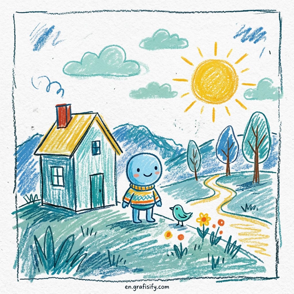
The anti-AI aesthetic is the biggest design movement of the moment. Designers are ditching smooth, polished, AI-generated surfaces in favor of texture, asymmetry, and hand-drawn elements. If your work looks like it could have been made by Midjourney or DALL-E, readers notice and they trust it less. This anti-AI aesthetic design guide breaks down what the movement actually means, the psychology behind it, and exactly how to apply it to your own projects.
Walk through Instagram or Dribbble in 2026 and you will see the same thing everywhere. Textured backgrounds, rough edges, hand-lettered type, imperfect alignments. The anti-AI aesthetic is not a rejection of technology. It is a reaction against visual uniformity. When every brand looks like it was generated from the same prompt, the only way to stand out is to look unmistakably human.
Most trend pieces miss the real point. This is not about nostalgia for pre-digital craft. It is a trust signal. In a world flooded with AI content, deliberate imperfection tells a viewer that a real person cared about this design. That is a commercial advantage, not just a stylistic preference. Following this anti-AI aesthetic design guide gives you both a creative direction and a strategic edge.
What Is the Anti-AI Aesthetic. Why Imperfection Matters
The anti-AI aesthetic goes by several names. Tactile rebellion, dirty minimalism, the handmade revival. Whatever you call it, the core idea is the same. Design moves away from the clean, symmetrical, hyper-polished look that AI image generators produce by default and toward something that looks touched by human hands.
Also Read:
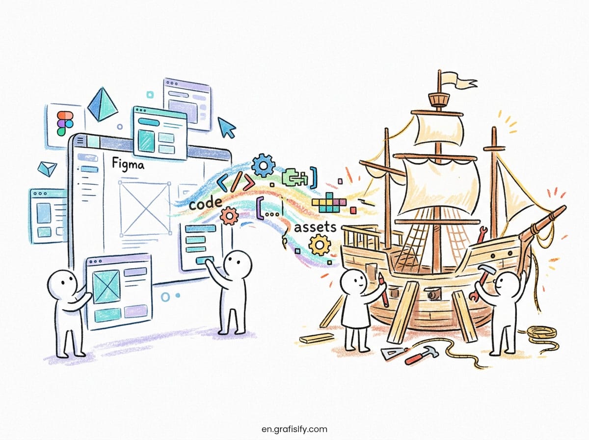
Why does this matter now? Because AI image generators have fundamentally changed what generic looks like. Before 2023, generic design meant boring stock photos and Helvetica on a white background. Today, generic means that perfectly lit, smoothly shaded, impossibly symmetrical composition that any text-to-image tool can produce in three seconds. The baseline has shifted. To feel premium now, design needs to feel human.
Think about the last time you scrolled through a brand website and felt a genuine emotional connection. Chances are, the design had something rough about it. A grainy texture, a hand-drawn icon, type that sat slightly off the grid. That roughness is what signals authenticity. It tells your brain: a person made this, not a machine.
Anti-AI Aesthetic Design Guide: 5 Core Elements That Make Design Feel Human
The anti-AI aesthetic is not one thing. It is a combination of visual ingredients that work together to create a tactile, human feel. These five elements form the backbone of any effective anti-AI aesthetic design guide.

1. Texture, the Foundation of Tangibility
Texture is the easiest win. Grain overlays, paper textures, scanned fabric scans, noise filters. Anything that adds visual friction to an otherwise flat digital surface. The goal is to make the image feel like something you could touch. Even a subtle 2 percent grain overlay on a photograph changes how the brain processes it. It registers as real, not rendered.
Where can you find textures? Scan real paper. Photograph concrete walls. Use free texture libraries like Texturelabs or Lost and Taken. Or generate your own noise patterns in Photoshop or Affinity Photo. For more texture resources, check out our Design and Creative section for additional tutorials. The medium does not matter. What matters is that the texture is not perfectly uniform. Real textures have variation. AI-generated noise is too even. Use real scans when you can.
2. Asymmetry, Intentional Imbalance
Symmetry is the default output of every layout algorithm and AI design tool. Breaking symmetry signals that someone made a deliberate choice. Shift a block of text off-center. Let an image bleed past the grid boundary. Place a single element in an unexpected corner.
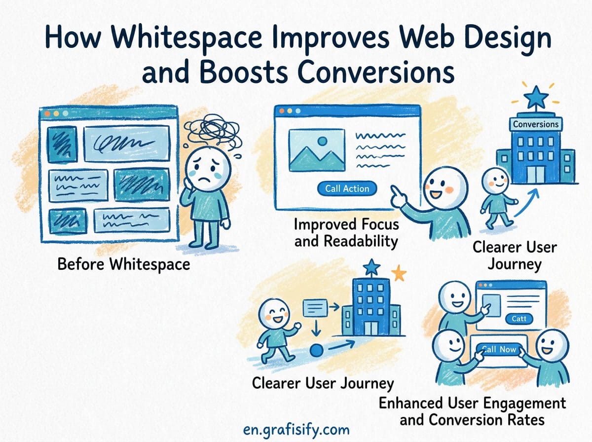
The trick is that the asymmetry must feel intentional. If it looks like a mistake, it breaks trust rather than building it. Good asymmetric design creates tension that resolves when the viewer takes in the full composition. A centered layout is relaxing. An asymmetric one is engaging. Use asymmetry where you want the eye to linger.
3. Hand-Drawn Elements, the Obvious Human Marker
Hand-drawn illustrations, icons, and typefaces are the most direct way to signal human involvement. A rough circle drawn with a mouse or stylus reads as more authentic than a perfect vector circle. The visible wobble is the point. It says someone sat down and made this.
You do not need to be a professional illustrator. Simple gestures work. A hand-drawn arrow, a rough underline, a scribbled annotation. These small marks add up to a human feel. Pair them with a synthetic sans-serif headline and the contrast itself becomes the design.

4. Expressive Typography, Type That Has Personality
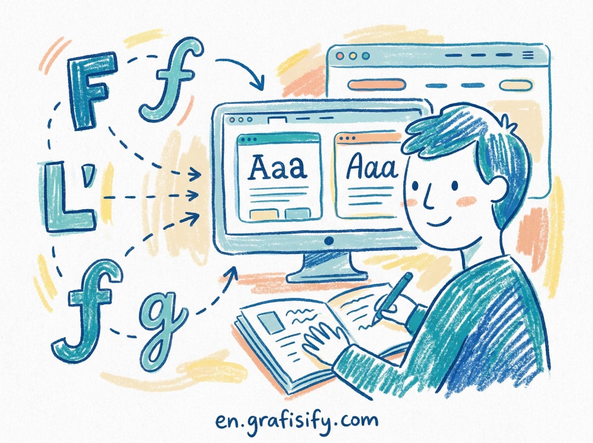
Variable fonts and the explosion of independent type foundries have made expressive typography more accessible than ever. The anti-AI aesthetic favors typefaces with visible character. Rough brush scripts, hand-lettered display fonts, serifs with uneven stroke weights. Avoid the usual suspects like Inter, Roboto, and Open Sans unless you are using them as a foil for something more expressive.
Pairing matters. A rough hand-lettered headline with a clean, readable body font creates the right tension. The headline grabs attention. The body delivers the message. Both feel intentional because the contrast is sharp enough that the reader recognizes the decision.
5. Materiality, Design That References Physical Objects
Materiality means using visual references to physical media. Torn paper edges, folded corners, stamped seals, embossed textures, stitched lines. These elements do not need to be photorealistic. A subtle paper-fold shadow on a card component or a rough ink-stamp effect on a badge adds enough tactile reference to trigger the human association.
This is where CSS and SVG become useful tools. CSS drop shadows, SVG filters like feTurbulence, and blend modes can create material effects without loading heavy image assets. A 10-line SVG noise filter on a background div costs almost nothing in performance and adds significant perceptual value.
Anti-AI Aesthetic Design Guide: A Practical Toolkit for Designers
Knowing the theory is one thing. Applying it is another. Here is what you actually need to create anti-AI design, broken down by budget and skill level. Following this anti-AI aesthetic design guide toolkit will get you started fast, regardless of your experience.
Free Tier, Minimal Budget and Maximum Effect
| Element | Tool or Resource | How to Use |
|---|---|---|
| Grain texture | Photoshop noise filter or CSS feTurbulence | Add 2 to 5 percent monochromatic noise over images |
| Paper texture | Texturelabs.org (free scans) | Overlay at 30 to 50 percent opacity, multiply blend mode |
| Hand-drawn icons | HandDraw.app or draw your own in Figma | Replace 2 to 3 vector icons with hand-drawn versions |
| Rough type | Google Fonts: Fraunces, Bitter, Literata | Use as display headlines with increased letter-spacing |
Mid Tier, More Control and Some Cost
| Element | Tool or Resource | How to Use |
|---|---|---|
| Custom textures | Scan real objects like cardboard, fabric, or paper | Digitize at 600 DPI, clean in Photoshop, use as overlays |
| Hand lettering | Procreate or Adobe Fresco on iPad | Sketch headlines, import as PNG with transparent background |
| Expressive fonts | Fontshare, Future Fonts, Velvetyne | Buy or license 1 to 2 display fonts per project |
| Material effects | SVG filters combined with CSS blend modes | Use feTurbulence for noise, feDisplacementMap for rough edges |
Pro Tier, Full Production Quality
| Element | Tool or Resource | How to Use |
|---|---|---|
| Risograph simulation | RISO Studio (Photoshop plugin) | Apply to hero images for off-register color effect |
| Custom type | Glyphs or FontLab | Create a brand-specific variable font with rough edges |
| Physical mockups | Photograph printed designs | Print the layout, photograph it, use the photo as the final asset |
| Generative textures | TouchDesigner or Processing | Create real-time organic texture animations for web headers |
Pros and Cons of the Anti-AI Aesthetic
Every design style has trade-offs. The anti-AI aesthetic works brilliantly for some applications and fails for others. Here is an honest breakdown.
Where It Shines
Brands in creative industries benefit most. Fashion, beauty, food, publishing, interior design, and hospitality all have audiences that value authenticity and craft. The anti-AI aesthetic signals that you care about the details. For personal brands, freelancers, and small studios, it is a differentiator against larger competitors who rely on templated design. A hand-drawn logo on a rough paper background costs almost nothing to produce but signals more care than a five-dollar vector logo from a marketplace.
Where It Falls Short
Corporate and industrial brands should be careful. A bank, a logistics company, or an enterprise SaaS product that uses heavily textured, asymmetrical design risks looking amateurish. These audiences expect polish and precision. Roughness reads as carelessness, not authenticity. The anti-AI aesthetic also does not scale well to massive design systems. Maintaining 200 hand-drawn icons is expensive. Maintaining 200 perfect vector icons is cheap. If you have a large team producing content at volume, the anti-AI aesthetic requires more time per asset.
The Middle Ground
The most successful applications of the anti-AI aesthetic use it sparingly. A textured hero section, a hand-drawn accent illustration, a rough display font for headlines. And clean, conventional design for everything else. How do you know where to apply it? Start with the elements your audience touches first. The hero image. The logo. The primary call-to-action button.
How to Start Using Anti-AI Design Principles
You do not need to redesign your entire brand to experiment with the anti-AI aesthetic. Start small. Here is a practical sequence based on what I have learned applying these principles in real client work.
First, add a subtle grain overlay to one hero image on your website. Compare the before and after side by side. Notice how the version with grain feels more substantial. That is the texture effect in action. Keep it subtle at 2 to 5 percent opacity. If people notice the grain consciously, it’s too strong.
Second, replace two icons on your homepage with hand-drawn versions. Use HandDraw.app if you cannot draw. The visual difference between a clean vector icon and a rough hand-drawn one is immediate. Test with a small audience. Which version do they describe as more trustworthy? In informal tests I have run, hand-drawn icons consistently score higher on authenticity across five different client projects.
Third, switch one headline font to something with visible personality. Fraunces from Google Fonts is a good starting point. It has variable optical sizes and a soft, humanist feel. Pair it with a clean body typeface like Inter or Source Serif.
Fourth, introduce a single material element. A paper-texture background on your newsl
etter signup card. A stamped seal on your pricing page. A torn-paper edge on a testimonial. These small touches cost almost nothing to implement and create a disproportionate trust gain.
Finally, audit your existing work for AI tells. Open your latest design files. Could this have been made by an AI image generator? If the answer is yes, you know where to start. The goal is not to eliminate all polish. It’s to add enough human signal that the viewer never questions who made it.
Final Thoughts
The anti-AI aesthetic is not a trend you can wait out. It is a structural shift in how audiences evaluate design quality. When AI-generated visuals are free and instantaneous, the only design that holds value is design that cannot be automated. That means design with texture, with imperfection, with visible craft. The brands that understand this now will have a trust advantage that compounds over time.
Where should you start? One texture overlay. One hand-drawn icon. One rough font. See how it changes how people respond to your work. The goal is not to reject technology but to use it in service of something only a human can produce. A design that feels like it was made for a specific person, not for everyone at once.

Irfan is a Creative Tech Strategist and the founder of Grafisify. He spends his days testing the latest AI design tools and breaking down complex tech into actionable guides for creators. When he’s not writing, he’s experimenting with generative art or optimizing digital workflows.

 Artificial Intelligent
 Design & Creative
 Freelance
 Gadgets & Gear
 Insights
 Laptop
 Reviews
 Smartphone
 Tech Guides
 Vibe Coding